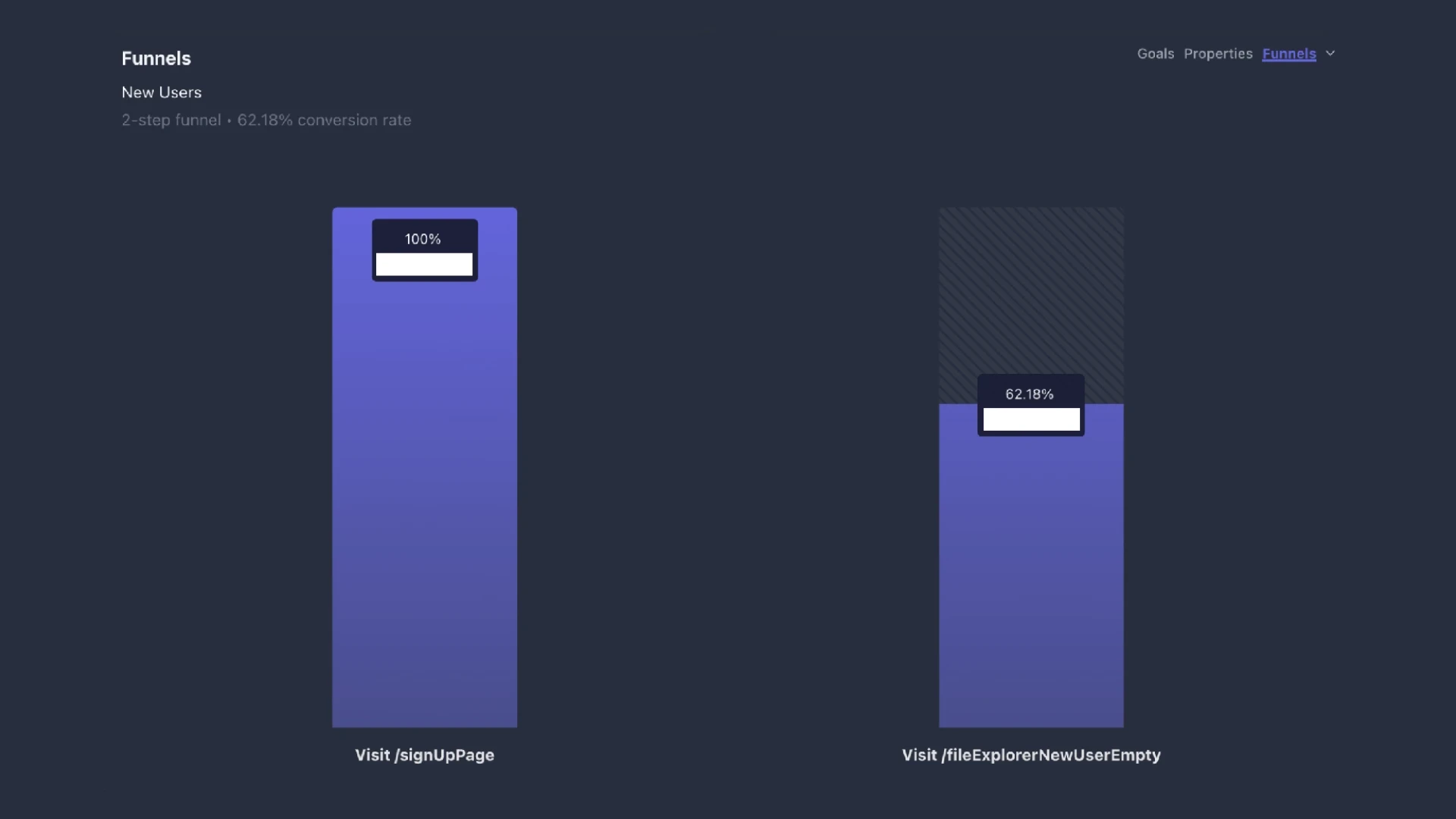
Boosting conversion rates, from 3.62% to 62.18%.
A focused redesign of ArDrive's onboarding and upload flow that 17×'d conversion without growing the team.
Friction to Flow: Product & Design Behind ArDrive's Onboarding Experience.
New to Web3?
To understand this design project, it is helpful to first embark on an unsolicited high-level history of the internet. ICYMI we are moving from company-owned internet platforms to community-owned internet platforms. Web1 (roughly 1989 to 2004) was characterized by users being in a "read-only" environment, whereby they could passively consume content online, and there were very few creators (developers).
Web2 (aka the internet we have largely participated in for the past two decades) has been characterized by a "read + write" dynamic — enabling user participation, interaction, and personalization. Applications — whether podcasting, social media, blogging, tweeting, e-commerce, etc. — gave users and participants the ability to contribute to each platform accordingly. The successes of a small number of software companies from Spotify to Shopify, and the FAANGs in-between, have helped us navigate the internet as seamlessly as possible. And we are hooked on that ease — even at the tradeoff of privacy, extortionate subscription schemes, platform-lock-in, censorship, security, and being at the mercy of advertising. Large tech firms went from focusing on user growth to monetizing users' activities, leading the internet to become highly centralized and dominated by a handful of monopolies.
Web3 is characterized by adding an "own" element to the read + write composition of a web2 world. This aims to solve a lot of these problems we find ourselves in now, with an emphasis on decentralization. The web3 paradigm generally aims to be community-driven, self-governed, and powered by blockchain technology. A common misconception that people often have when they hear or read the words "blockchain" or "web3" is that they often associate them with essentially being synonymous with cryptocurrency. But crypto is simply an application of the technology.
A mental model that helped demystify web3 for me early-on, was to understand that the first killer app for the internet was actually email. Before that, there was a general ambiguity of value. The email use-case is really what helped the technology go mainstream and opened up a sprawling entrepreneurial sandbox for technologists, designers, and engineers to begin to imagine all of the other opportunities that the technology could make possible. Similarly, the first killer app for blockchain technology was cryptocurrency (popularly Bitcoin). Ethereum added a computational dimension to the crypto use-case, laying the groundwork for other types of apps to be built on top of blockchains. We now have a similarly wide open landscape of possibilities of what can be built, or re-built better. In the words of Chris Dixon, a16z:
Blockchains solve the same problems that other digital services solve, but with better outcomes. They can connect people in social networks, while empowering users over corporate interests. They can underpin marketplaces and payment systems that facilitate commerce, but with persistently lower take rates. They can enable new forms of monetizable media, interoperable and immersive digital worlds, and artificial intelligence services that compensate — rather than cannibalize — creators and communities.
TL;DR
We rebuilt ArDrive's wallet-first onboarding to feel familiar to Web2 and 2.5 users without sacrificing decentralization - lifting conversion from 3.62% → 62.18%, cutting CAC, and increasing first-session uploads (a strong retention proxy).
Top takeaways
- Clarity beats jargon: Separated sign-up vs. log-in, rewrote copy, and added guardrail microcopy around wallets/seed phrases.
- Action over education: Replaced "tutorial slides" with actionable first-run tasks (create drive → upload file), guided by the Goal-Gradient effect.
- Value up front: New bento landing compresses value prop, paths, and proof into one scannable screen.
- Measure to improve (privately): Added a lean, privacy-respecting event model to expose drop-offs, time-to-first-upload, and tutorial skips.
- Results that compound: Conversion to new user 3.62% → 62.18%, healthier CAC, more in-session uploads; launch momentum with #1 Web3 Product of the Week.
My role & scope
- Role: Head of Product & Design
- Team: 2 PM • 4 Design • 9 Eng • 1 QA
- Scope: Onboarding UX/UI design, research, event instrumentation & analytics, design system updates, delivery & QA
What's inside this case study
- Context: Why Web3 onboarding is different (wallets, recovery, fees, mental models).
- Problem: Where users dropped off and what metrics told us.
- Research: Analytics, qualitative signals, and privacy-aware measurement.
- Strategy: Meet Web2.5 expectations without compromising decentralization.
- Solution: Bento landing, clear auth split, actionable first-run tasks, copy & patterns.
- Execution: Design system updates, event model, delivery/QA.
- Results: Conversion, CAC, retention proxies, launch impact.
- Lessons & Next: What we'd iterate (policy packs, A/B, custodial → non-custodial ramps).
Context
With the habits formed through years of using web2 digital products — we are conditioned to find those patterns intuitive. We generally expect for example, that creating a new account will require an email/username and a password. In earlier days, that entailed educating users, building trust, repetition; and through decades of user research that sign-up / log-in user experience has been honed to a science.
With the great benefits of web3 we get to unlock an entirely new design space, but we also face a whole new set of design challenges. Among those can be an ambiguity of product value, an onus of trust-building, sometimes having to manage cryptocurrencies, a lack of profound user-research, a lack of relevant education, navigating wallets, transaction fees, immutability (aka you can't forget a password because the organization that built the platform doesn't know it either, or keep it stored anywhere), and often complex on-boarding to call-out only a handful. Designing web3 B2C apps and platforms can be especially complex in this regard.
ArDrive
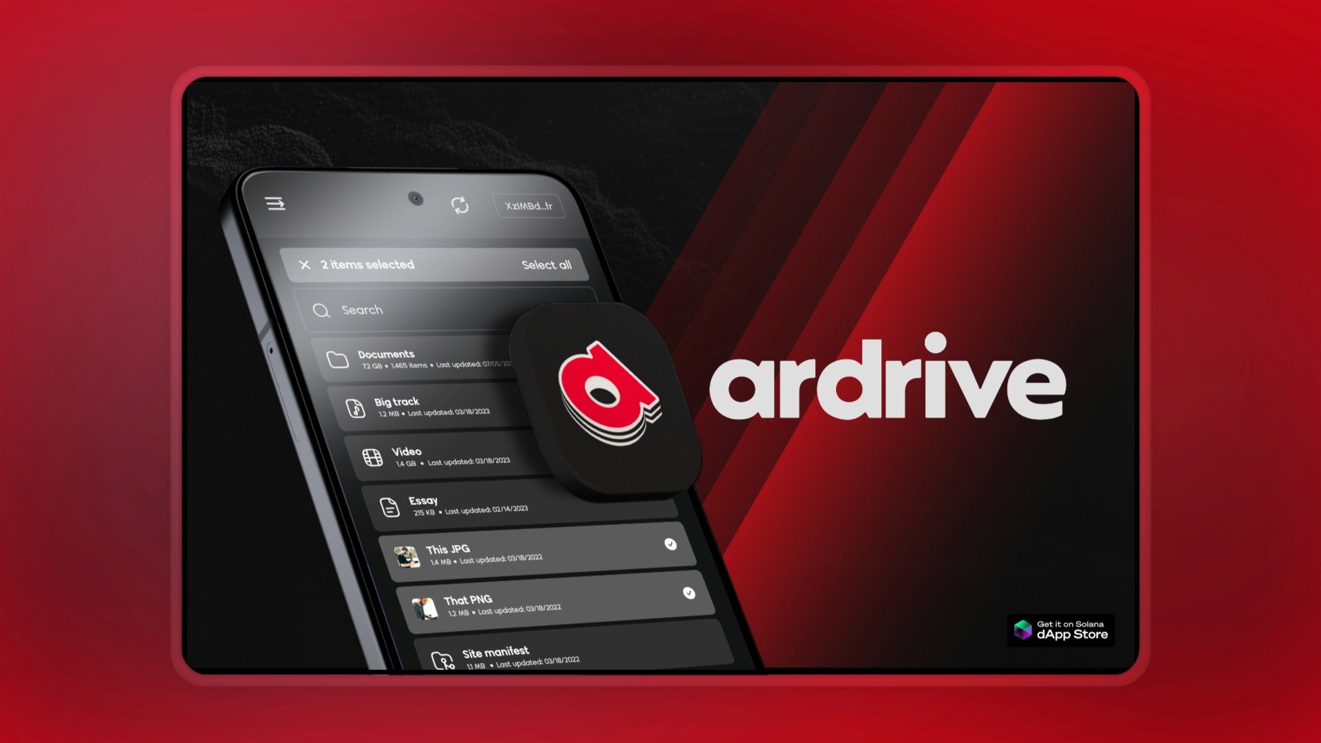
On the surface ArDrive seems like blockchain DropBox, but it is so much more. It is built on permanent data, which I like to think of as the 0-1 invention that no one is talking about. It enables users to exit the cloud and take back ownership of their wallets, privacy, and digital data.
ArDrive's suite of web and native apps are already enabling 50,000+ users (and counting) to securely save, manage, and share their photos, files, and documents - by leveraging the power of a pocket blockchain: Arweave.
Problem
At ArDrive, we found a problem whereby our conversion rate was low. Specifically, we had a high number of potential new users landing on the app but churning before setting up an account. Obviously this high bounce hinted at some inefficiency. Early assumptions as to why, were: too much jargon, high numbers of visitors were from non-targeted personas, bugs and performance woes, and poor on-boarding UX, among others.
Research
As guided by the design process that my team and I developed and refined over the years we would - not always - but typically look to start with either a project brief (for smaller initiatives) or a business case (for larger initiatives) that clearly mapped to our organizational goals, and was intended to ask ourselves up-front critical questions like:
- Why does this project exist?
- What are the details and the history of the opportunity?
- Why is it important to the organization to solve this problem?
- Are there any constraints (time, technical, financial, legal, or otherwise)?
Our business cases would tend to be deliberately thin at first, and then come to life over subsequent phases of our process.
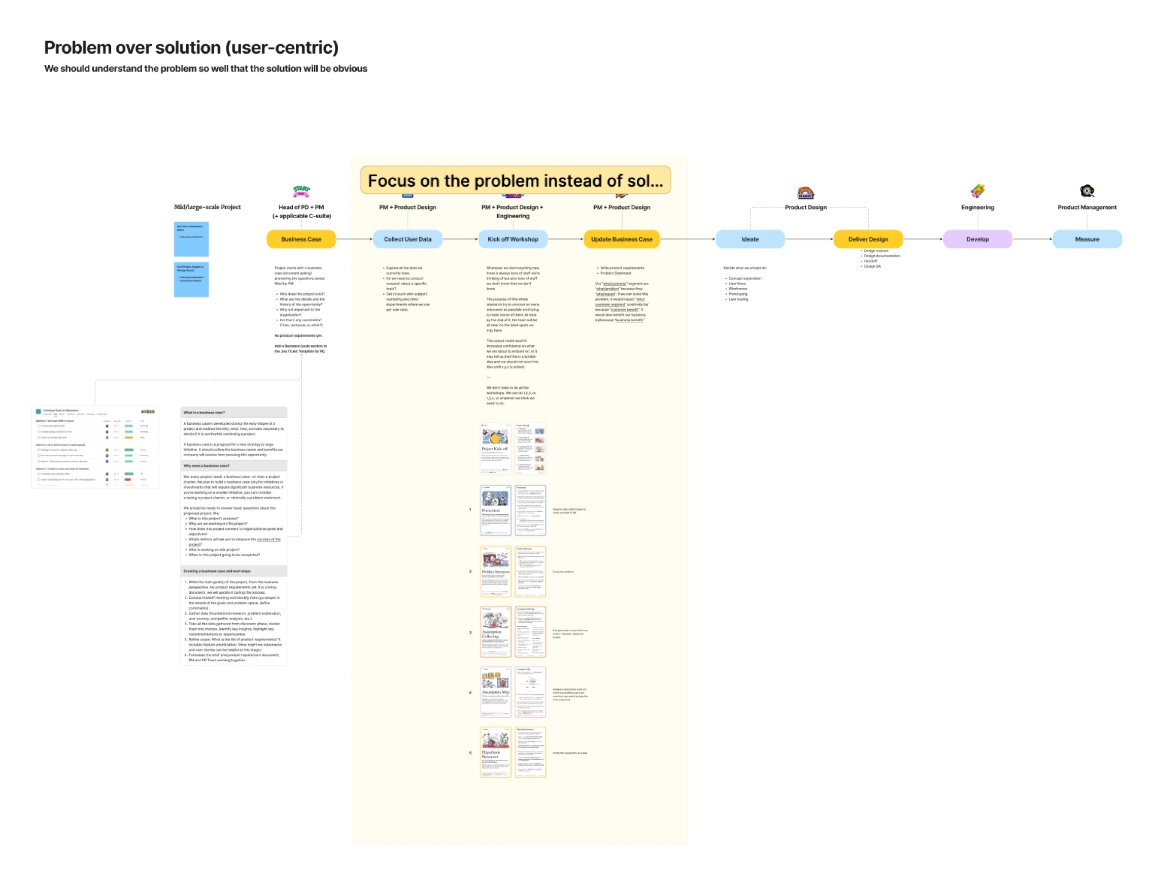
After setting up our business case, my team and I would typically aim to engage in, and consolidate research. We explored all of the data we had via on-chain metrics, in-app analytics, user surveys, interviews, our Discord channels, and by collaborating with our Community Manager. Research would usually also entail our own usability testing with incumbent web2 predecessors and emerging web3 design patterns.
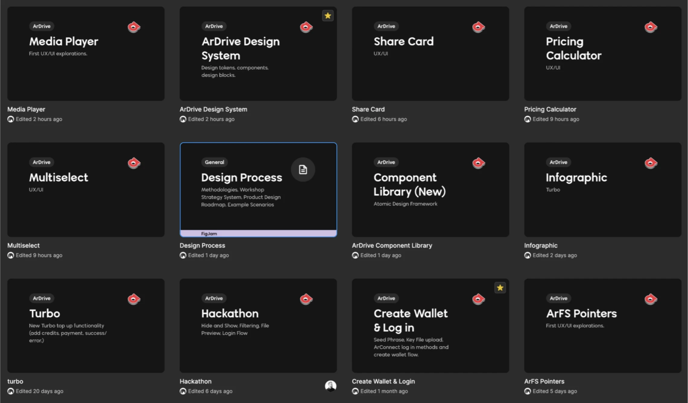
For our on-boarding problem, we asked ourselves questions like:
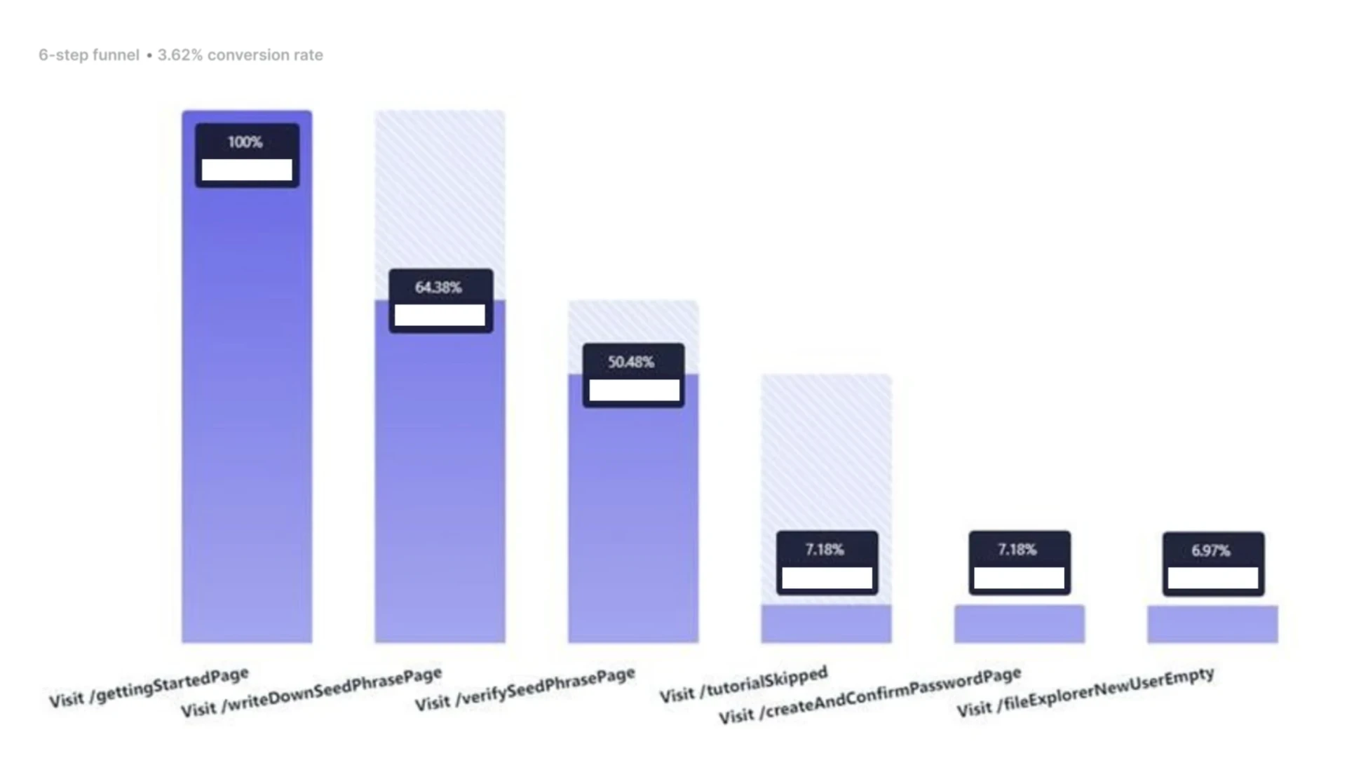
- What do we already know via analytics and support requests? We knew that over 95% of people landing on the first view of the app would not make it to the empty state. We knew that we were losing ~59% of users that entered the New User Flow before becoming users. We also knew that our largest drop-off points for people entering the on boarding flow were: the 'Getting Started Page' (~21% of people that got there left immediately), the 'Write Down Wallet' screen (~22% of remaining people left here); the 'Verify Wallet' ask (~33% of remaining people left here). And intriguingly - if users did complete the tutorial pages they usually converted to becoming new users at a nearly 100% rate.
- Could we gain any other insight into how people were interacting with the tutorial pages? We could learn what pages users left on, how long they stayed on each page, and if they skipped them; and our data suggested that most were skipping right through them.
- Can we discover what is happening if a new user did get all the way in? Did they just click the "new drive" button or was it the "question mark" for help? We did not have events set up for these interactions.
- If a user did make an account but never uploaded anything, were we watching that data close enough? We weren't.
- What conversion rate did we want? At the time, 3.62% of people that entered the on-boarding process became new users. However, ~83% of those who became new users, also performed a secondary action in that same session (create new drive and upload file were the most common) converting them to an "existing user."
- What else do we want to find out via on-chain metrics and better event handling? Our on-chain analysis needed improvement.
With a core tenet of the web3 ethos being privacy — user analytics, data collection, account information, and the corresponding tooling to these ends are not as readily available as they have become when designing and managing products for the incumbent web2 paradigm. So we had to get creative and find a way to paint a picture while staying true to this principle around user rights. Naturally, the design of accountless log-in methods enabled by wallets and keyfiles already provide some of these benefits by default. In our case, to use ArDrive you needed a wallet, which was a new way to log in. Instead of creating usernames and passwords, just connect your wallet.
If we could solve these problems it could impact new users positively because they may be able to use the app more efficiently and leverage its benefits quicker. It could also increase retention by helping users understand the value proposition and get them to that value sooner — if there is a higher chance of them making that first upload (thereby storing some of their value in the platform) there is a higher chance of them logging-back in a second time. It could also reduce support costs by providing clearer guidance upfront, increase user satisfaction by assisting them to feel confident in using the application, increase revenue potential by introducing them to premium features, improve our cost of acquisition (CAC), and strengthen the overall brand perception by providing a user-friendly product.
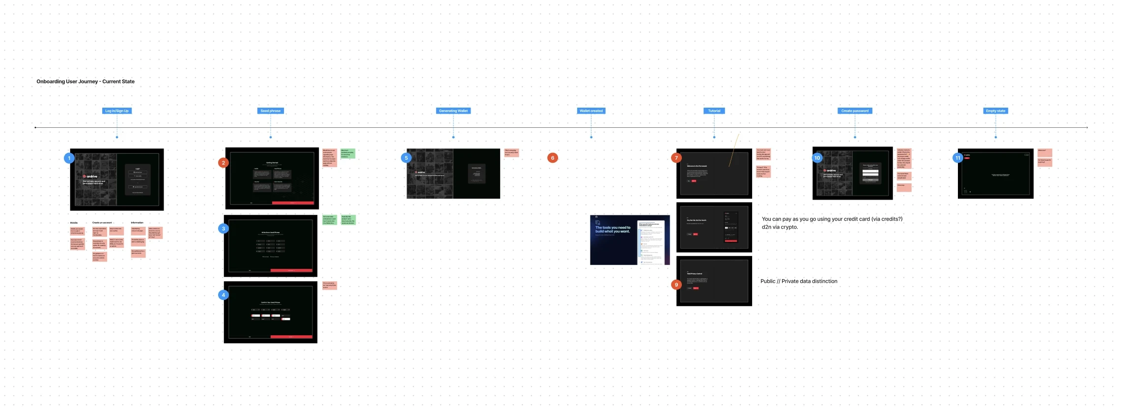
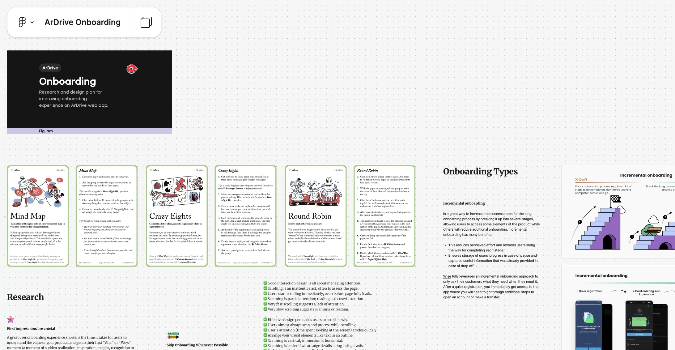
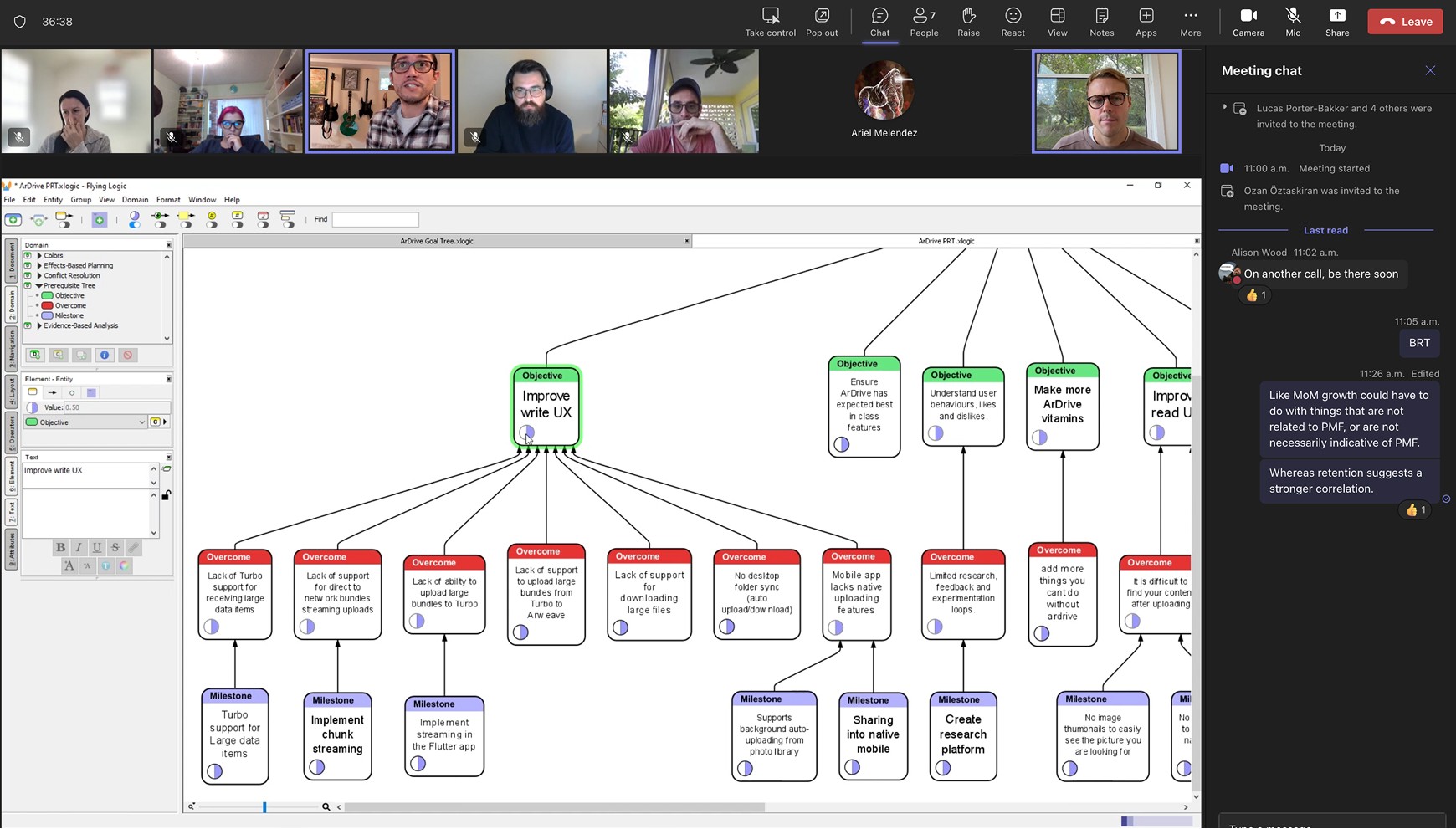
Our research began to validate the flawed on-boarding hypothesis and so I designed and kicked-off a series of workshops to re-visit the psychology of our user personas, take stock of the current end-to-end user journeys, and identify pain points (while referencing our user research and feedback).
- What was the current Journey?
- What are the key steps?
- Where were the errors taking place?
- How to reduce friction?
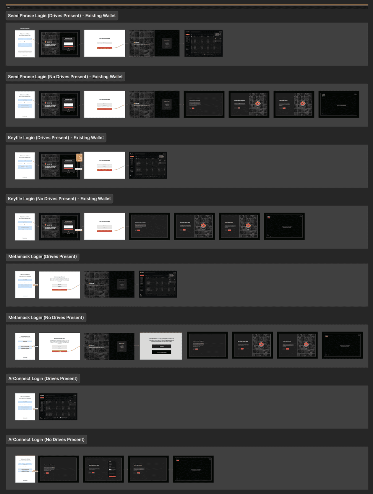
The purpose of these sessions was to try and uncover as many unknowns as possible and to challenge our riskiest assumptions about how the project could go. Findings would then update our business case so that we could define the initiative with more confidence before moving onto the next stage.
This process also helped in achieving alignment on what the initiative looked like - so that engineering, marketing, and product design were on the same page and were in a better position to collaborate. At times, the process could even help us discover that we should not pursue a given project at this time.
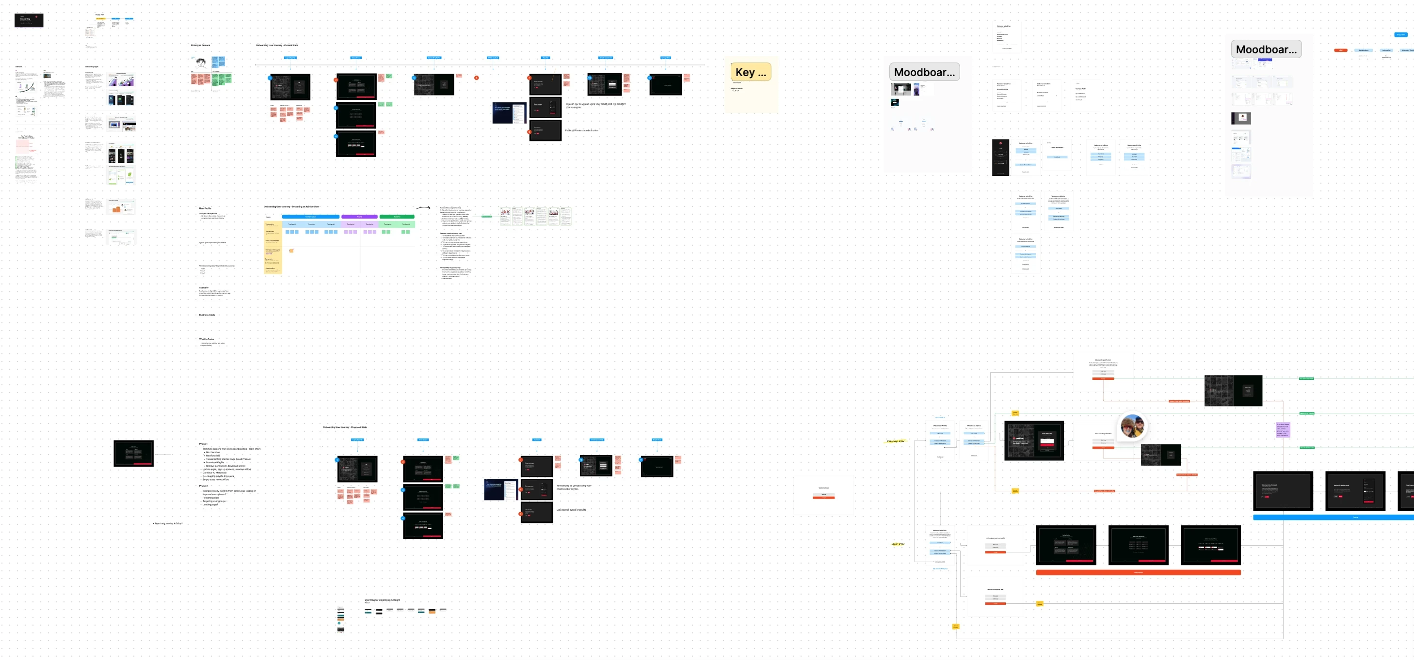
Some key findings were that:
- Web2 and web2.5 users were having difficulty creating accounts, due in part to the whole wallet and seed phrase concepts.
- There was no clear separation between log-in and sign-up functionality.
- There was confusion around public data and private data (i.e. while Arweave is a public blockchain, ArDrive lets users store encrypted private data on it).
- Given that we had no cloud log-in option, potential new users on mobile could not use browser extensions.
- There was an intimidating amount of jargon.
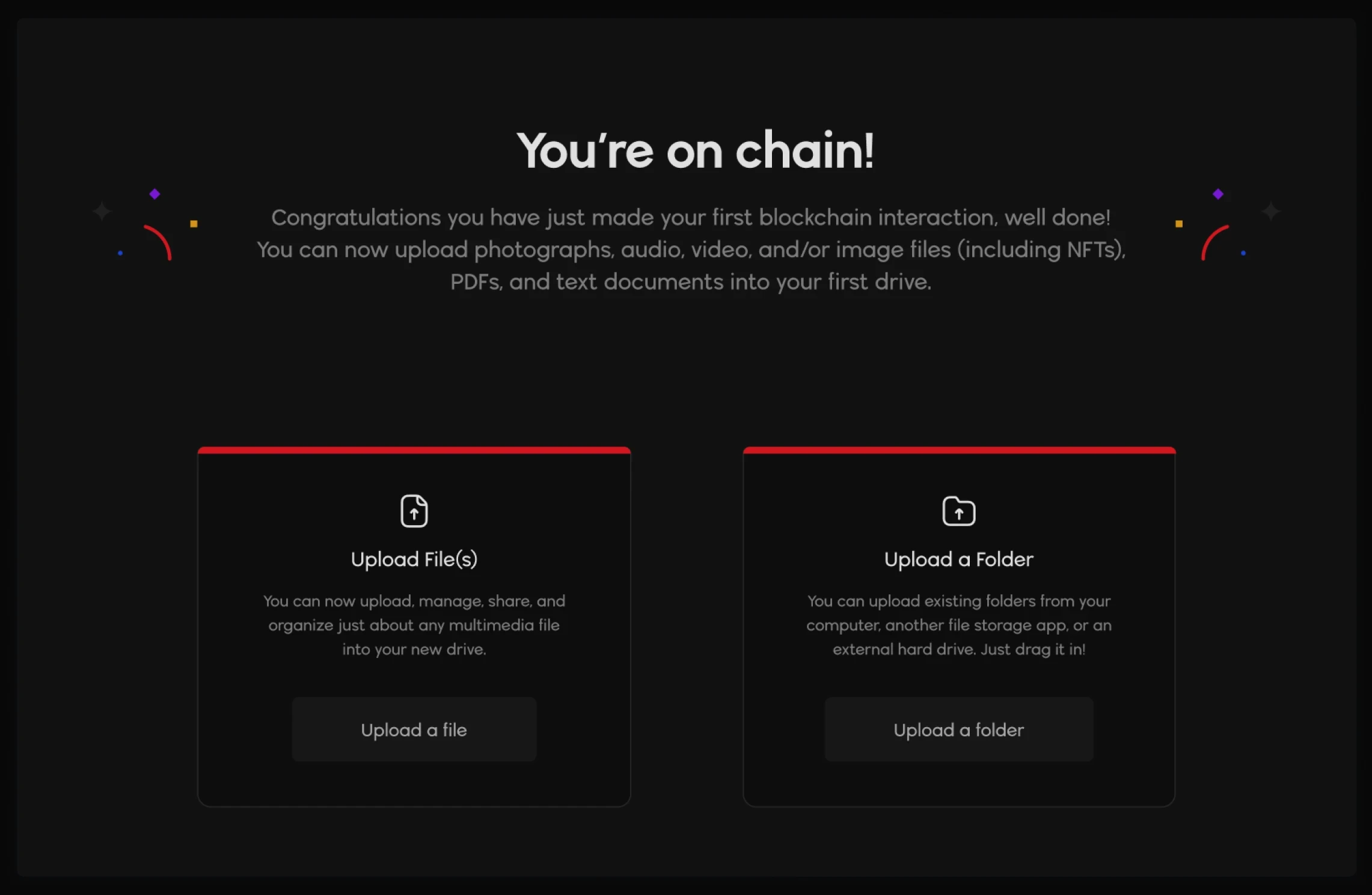
- If users did manage to get beyond the account creation part of the journey, our tutorial flows were being skipped. Users found them to be more high level about the benefits of using ArDrive without being actionable on how to benefit from the features.
- TL;DR - we were neglecting to guide new users on their first core journey; to their first 'aha' moment, as we say.
After aligning around these findings, we would update the business case and determine goals and non-goals, what success looked like, and began to brainstorm some early requirements. We would also try to conduct a sort of pre-mortem to anticipate what could go wrong in pursuing the initiative, and how we might mitigate any of those potential events. Finally, we would lay out how we would measure the results and impact of the overall initiative.
Our goals here, were to streamline the on-boarding experience to improve our conversion rate (of people landing on the home page to becoming an active user); to optimize the positioning of the app by persona; and to improve the overall usability of the ArDrive app. We aimed to positively impact user adoption through improved design, and to shrink the time to value between the first impression and that 'wow' moment (aka uploading your first file). Our first target was to get our conversion rate above 5%.
Ideating, wireframes, and prototyping
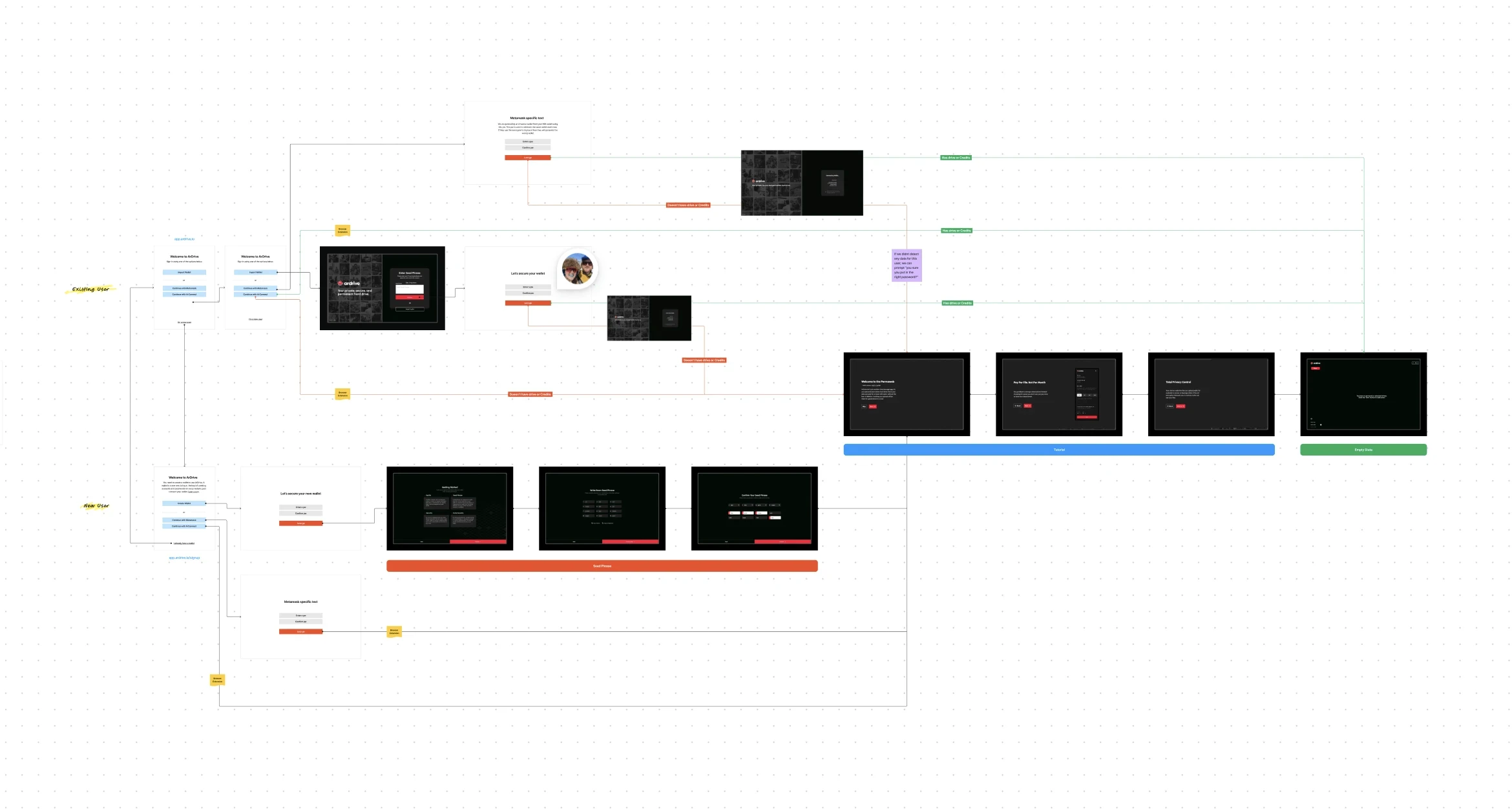
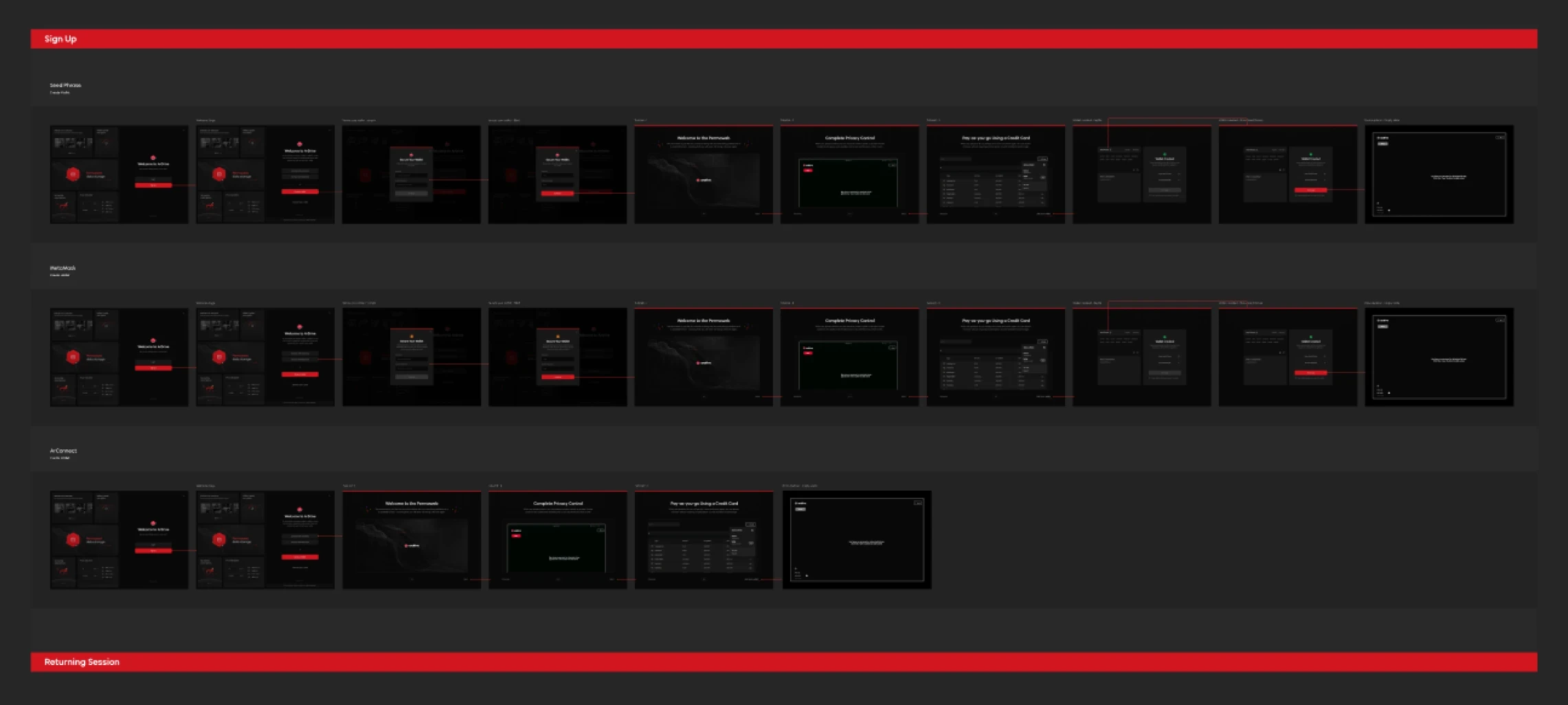
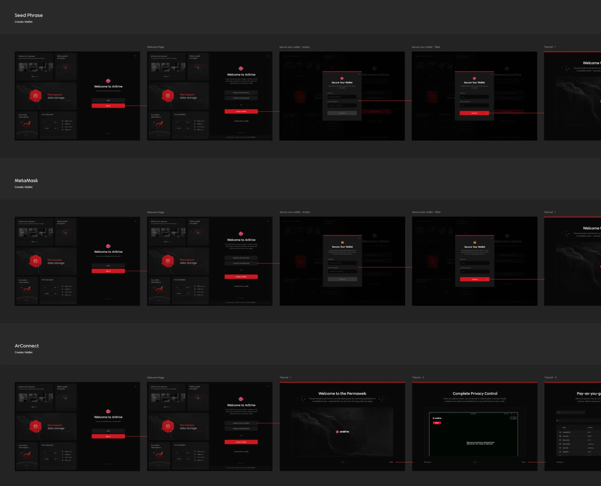
This step of our process could often entail concept exploration, mood-boarding, generating user flows, creating wireframes, prototyping, and at times user testing. For this case study, we started by documenting and mapping-out all of the current pathways into the app. There were 15.
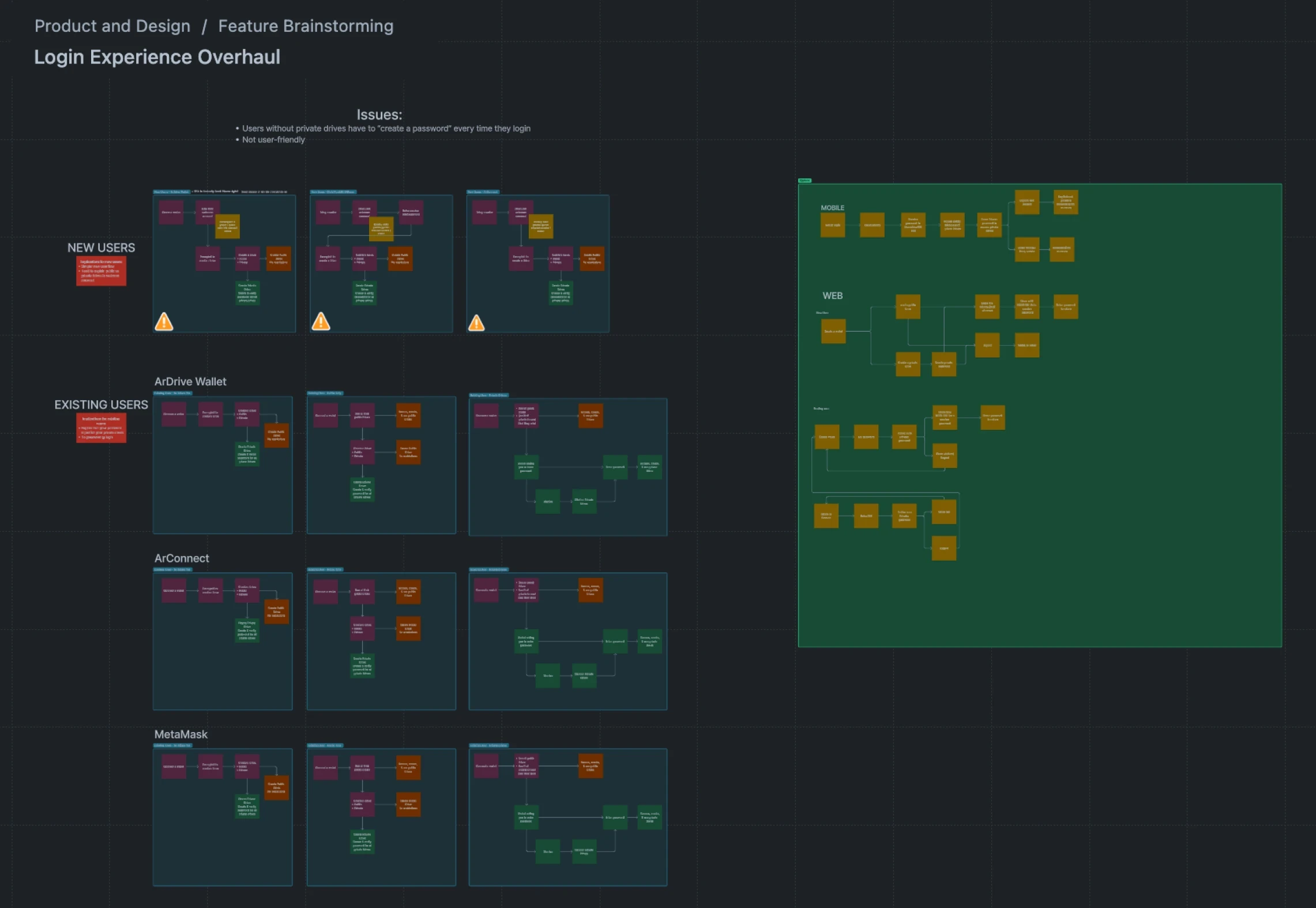
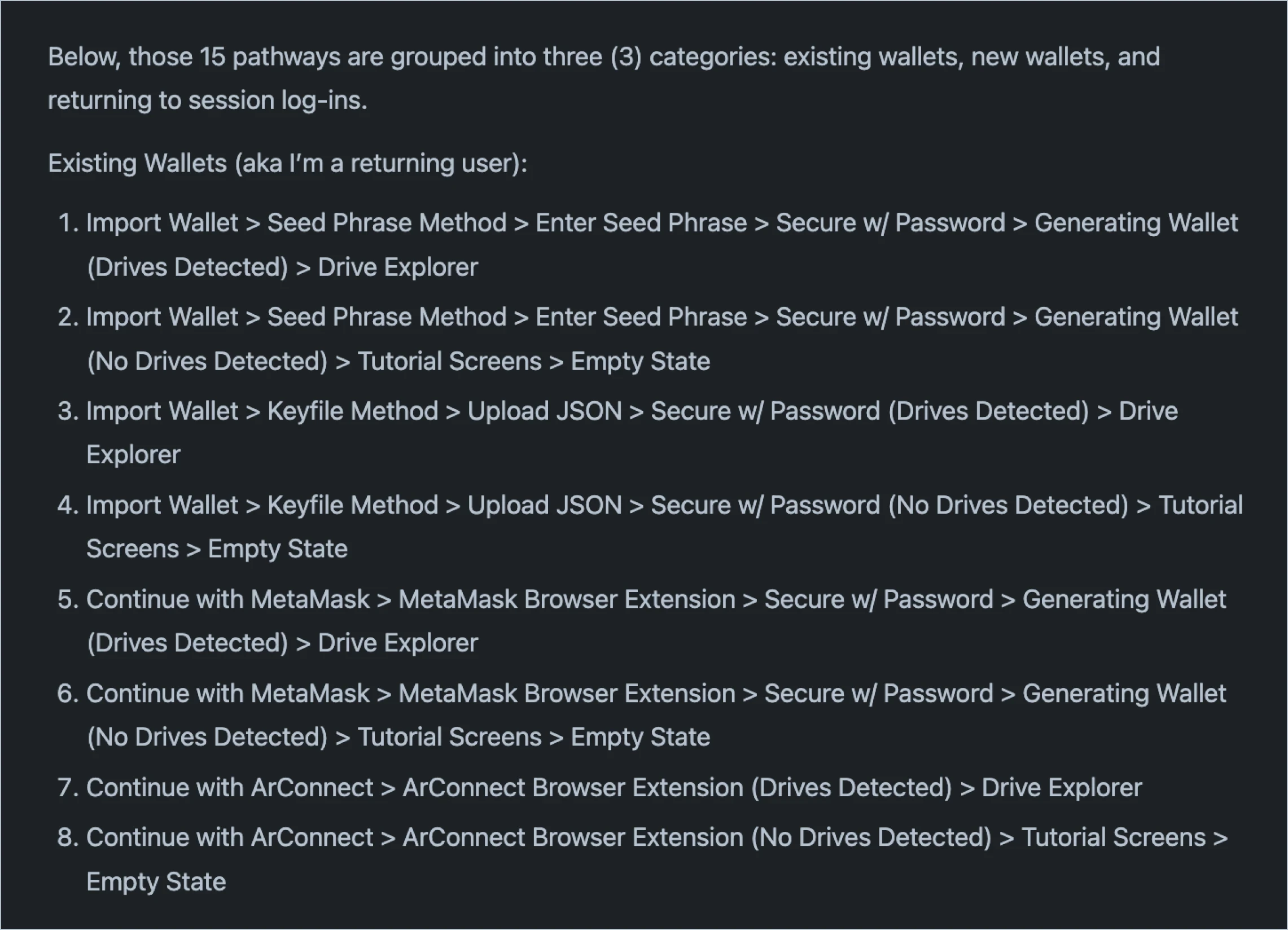
New wallets and returning session pathways are not pictured above.
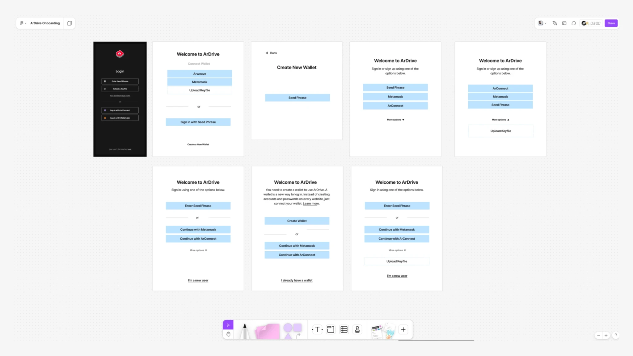
Early wireframes to test different grouping options on sign-in:
Visual Design
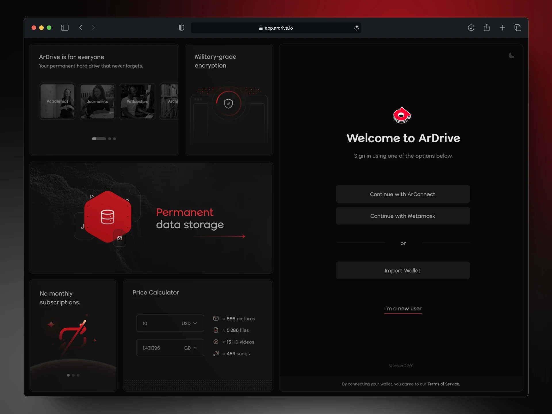
After multiple rounds of wireframing and refining new user flows, we completed and delivered an initial design. Through feedback and collaboration with the team and stakeholders we moved the project out of Design QA purgatory and into a buttoned-up new UI file. Of course, we also prepared all necessary documentation before handing it off to engineering.
There are plenty of hilarious memes out there highlighting the gap between a product's initial design and its final implementation (the reader of this has no doubt seen a few) — but a goal I always get my teams to strive for is to make it really hard to tell when they're looking at the Figma, or at a build branch.
Solution
Our goal was to design a user-friendly layout that clearly explained ArDrive to Web2.5 users, making it easier for them to understand its purpose. We also focused on simplifying the login and sign-up process, transforming tutorial screens into more actionable guides, and minimizing friction throughout the onboarding experience.
We devised the bento layout idea to give as much information as possible in a limited space:

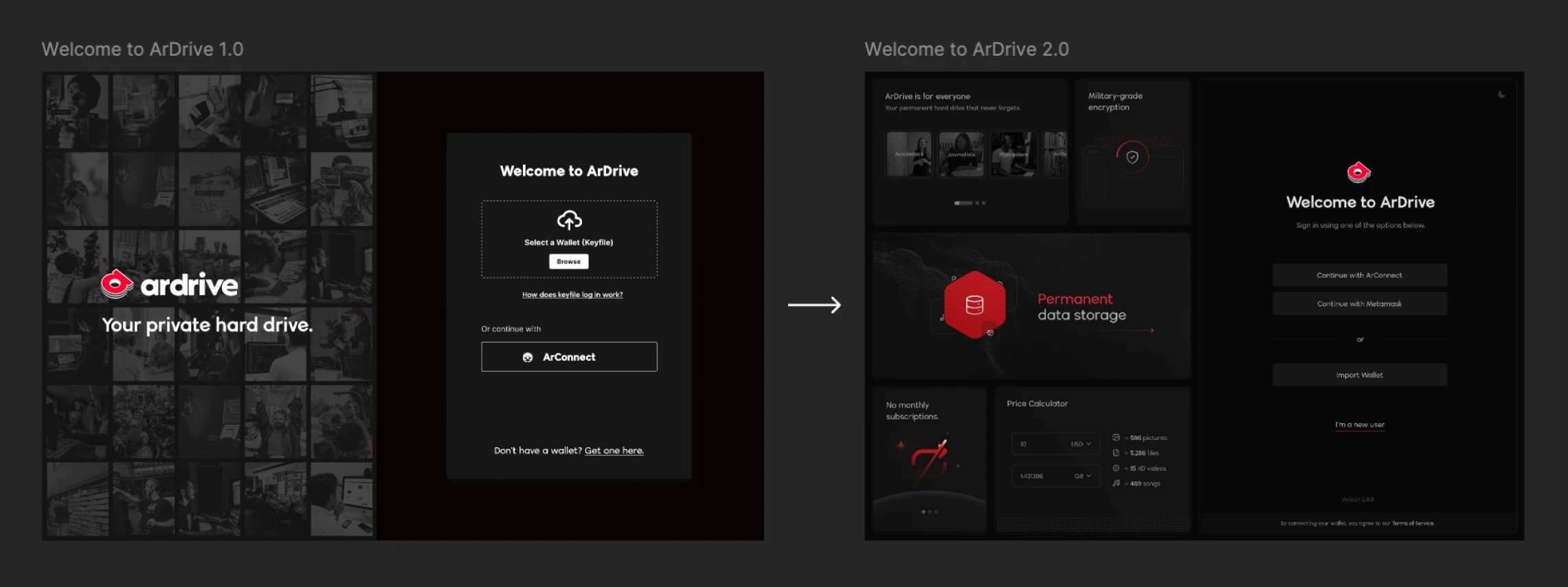
Old landing UI shown left, new landing pictured right.
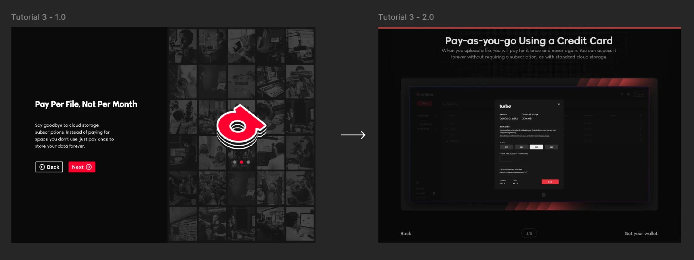
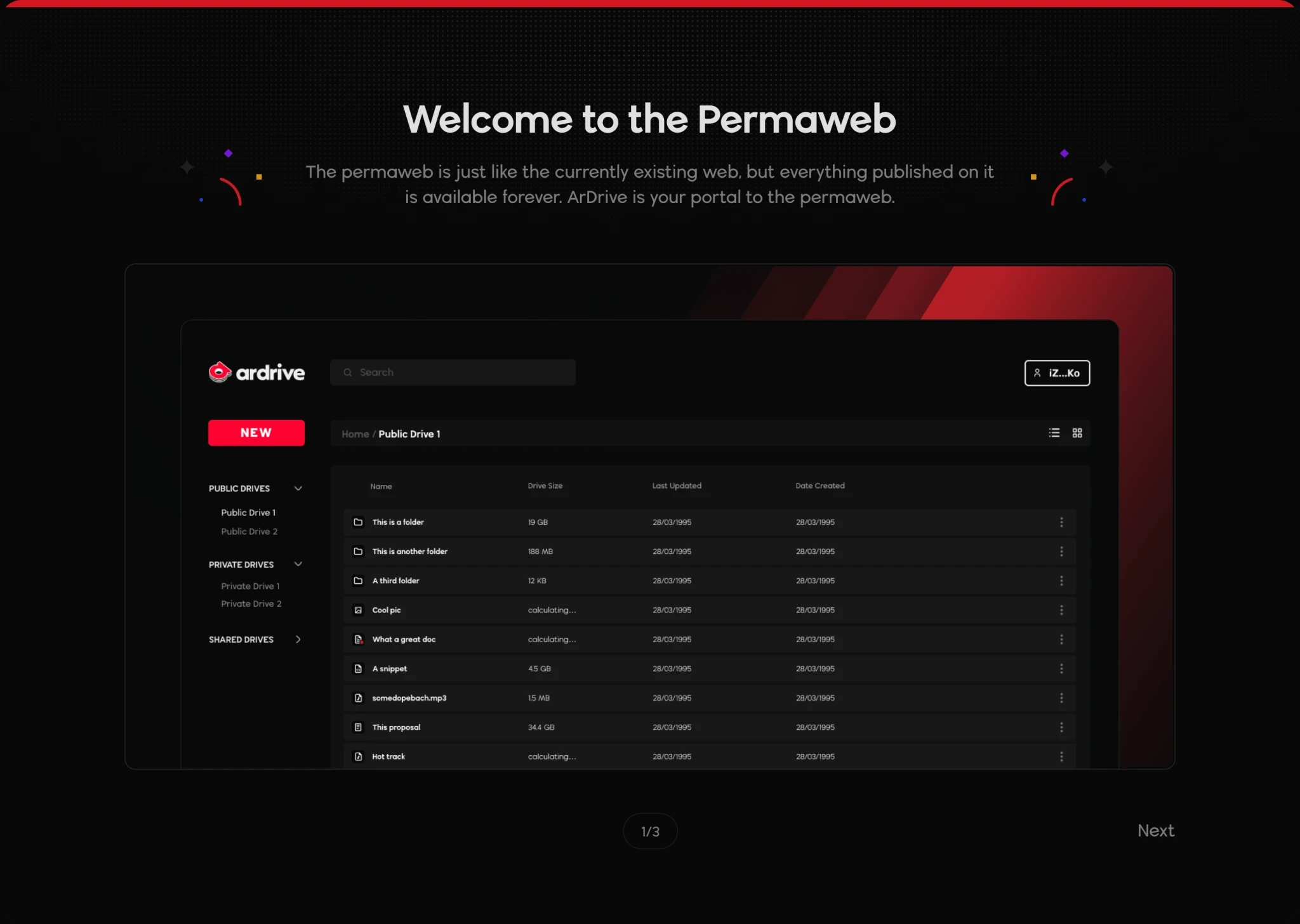
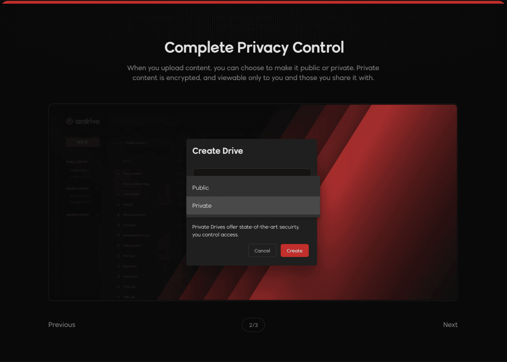
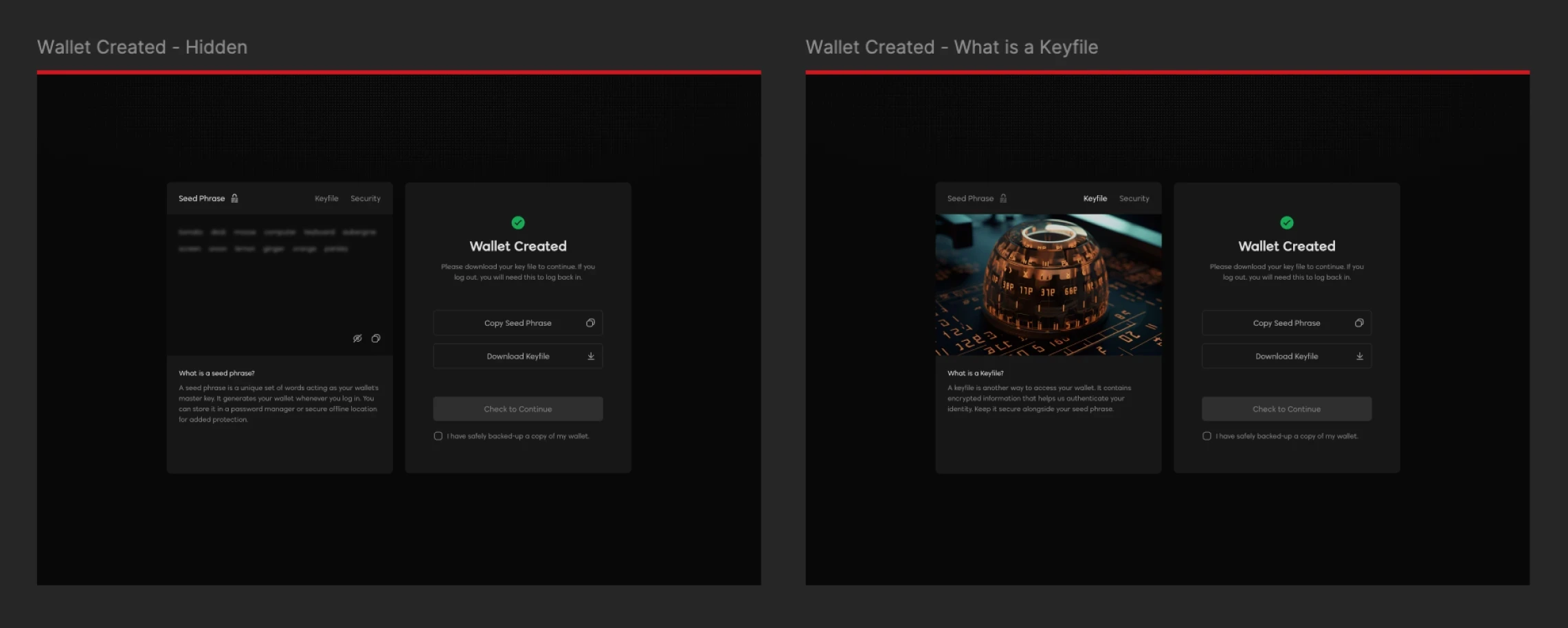
We utilized a psychology insight known as the: The Goal-Gradient Effect. This theory suggests that motivation increases as users get closer to their goal. By showing an already completed step, it gets users to understand that their journey already has started and can increase the conversion rate of taking that next step, and engaging in that first top-up.
Any new design tokens, components, variables, or design blocks that were created in the process were then commit to our design system.
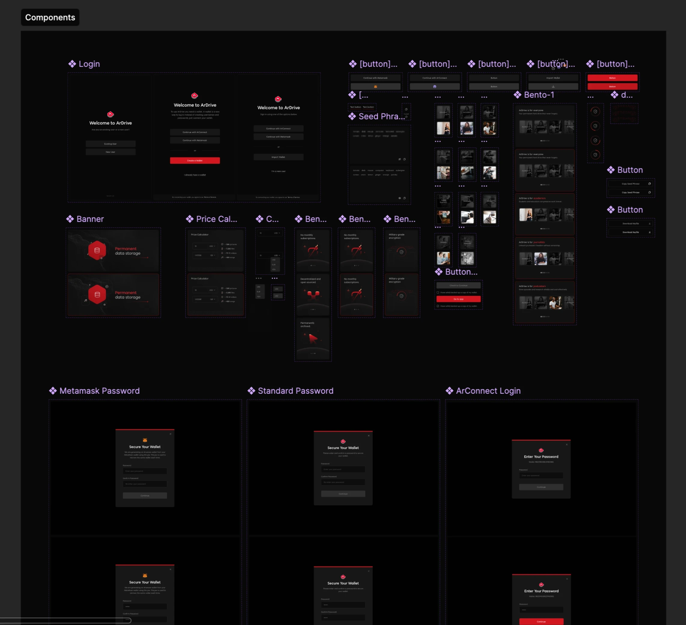
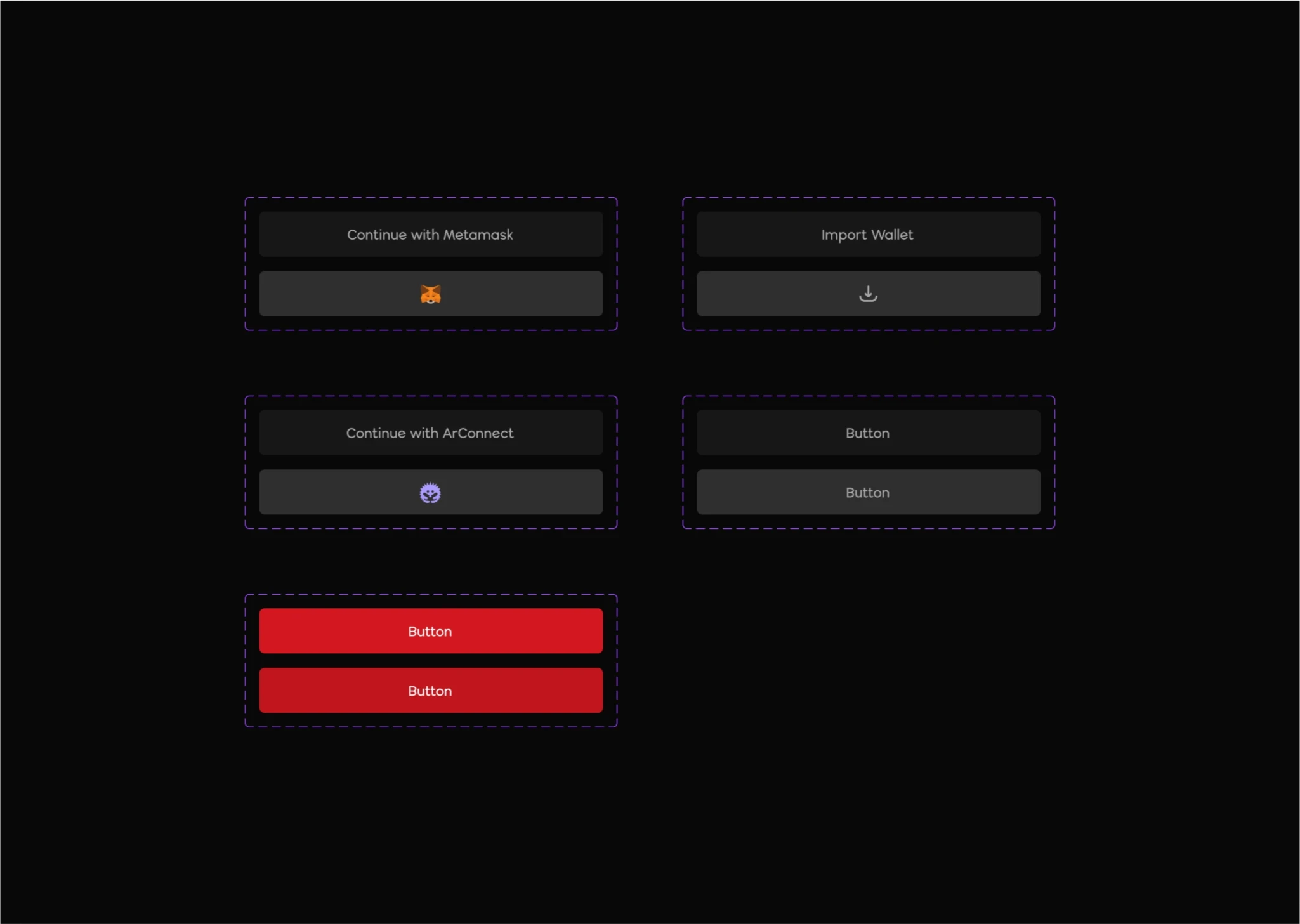
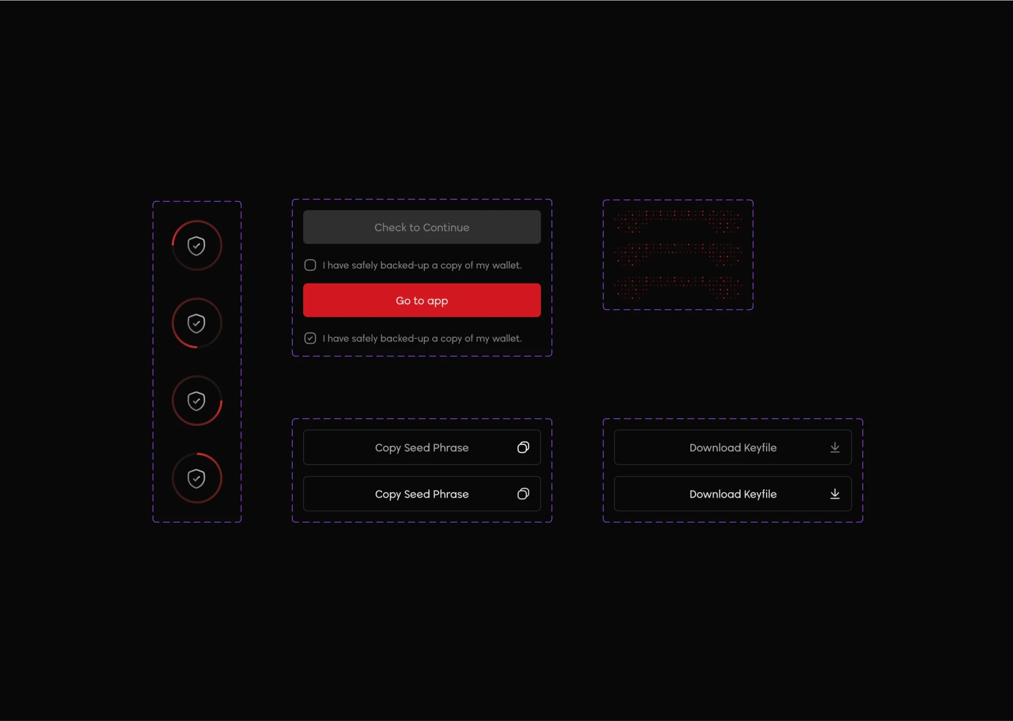
We also implemented a new system of events to measure how effective the new release was and to provide continuous feedback so that we could iterate and tweak from there.
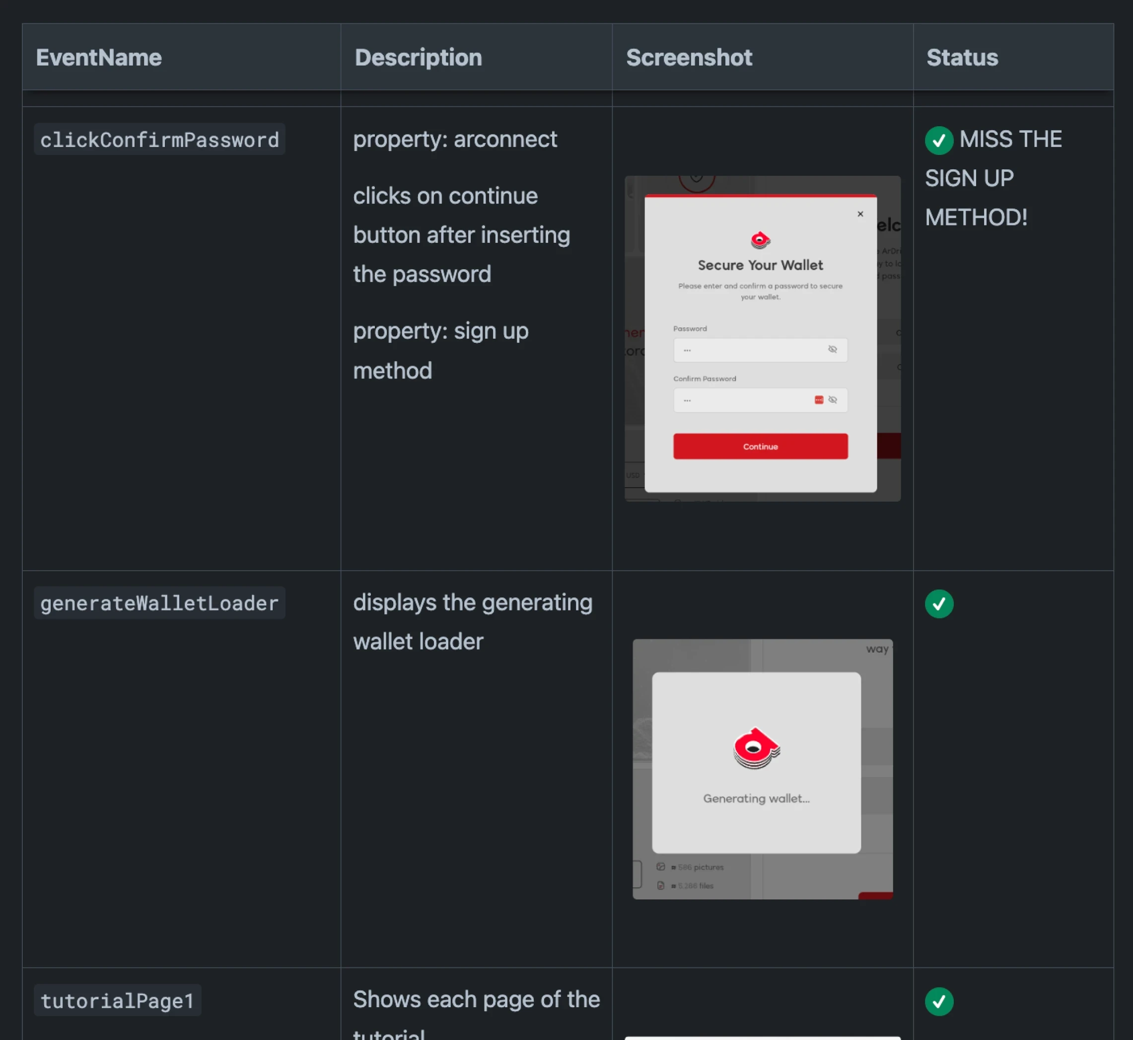
Usability Testing
For the on-boarding initiative our testing cadence involved collaboration between the product team, engineering team, and our own internal QA team. We also tested early builds via branches with some closed groups. We did not employ any A/B testing methodology for this specific initiative.
Measure
Since releasing the overhauled on-boarding initiative we saw a dramatic improvement in our conversion rate to over 62%. This rate reflected new visitors landing on the sign up page —> to entering the new user empty state. This helped lower our CAC significantly, improved retention, positively impacted revenue, and helped us to better understand our users.
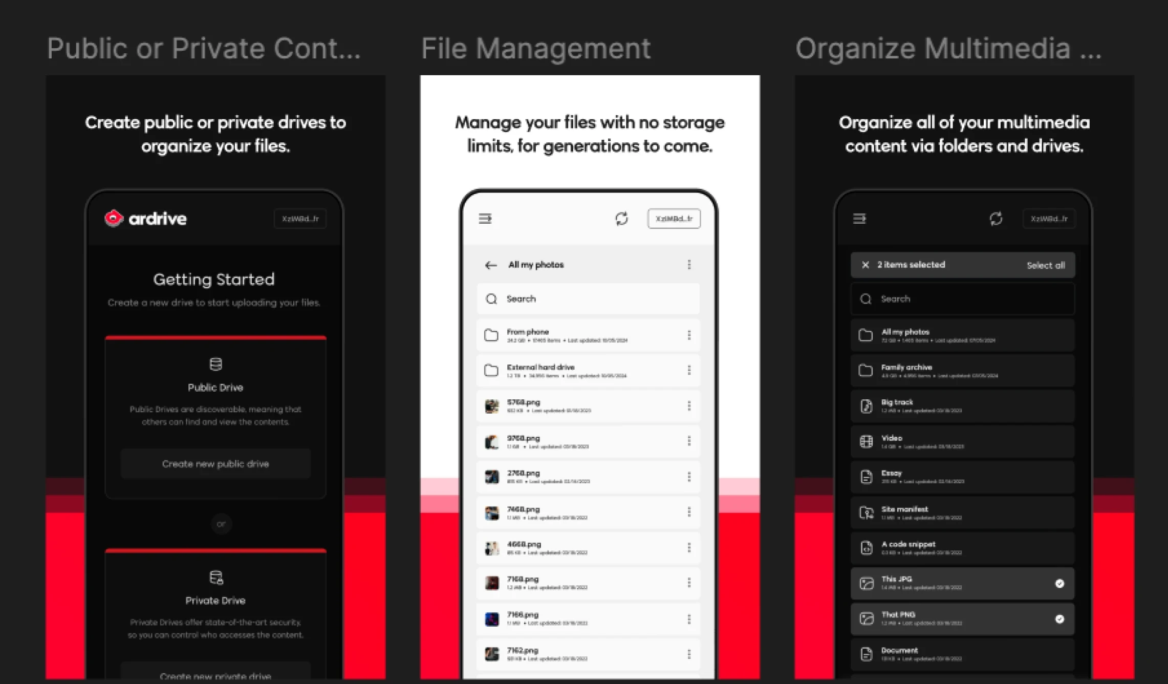
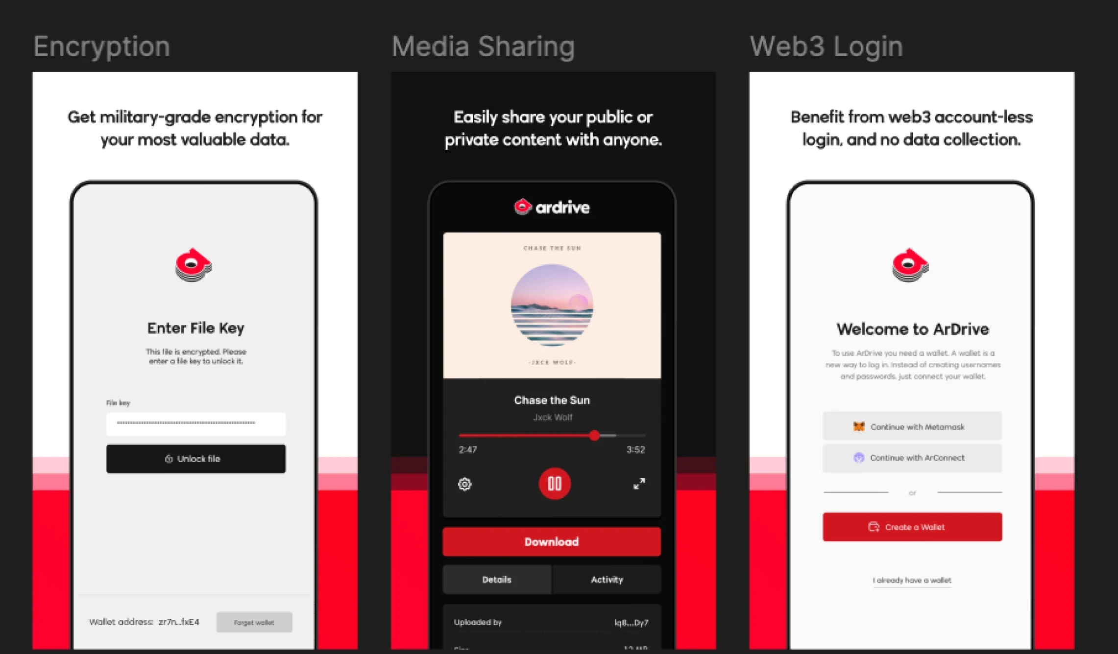
A month after releasing the initiative ArDrive claimed #1 Web3 Product of the Week on Product Hunt and a "probably nothing" spot on the Top Web3 Products of 2024. It was awesome to get thousands of new people banging on the app so quickly and witnessing the new on-boarding experience out in the wild.
Some Reflections on ArDrive and Designing for Web3
An interesting approach that some web3 projects have done quite well is meeting users where they are, in web2 world. They do this by using familiar concepts and integrating well with people's favourite tools, and then leading them into new experiences from there. It's funny that some of the most exciting parts of web3 products are precisely where so many first-time users churn; and where so many potential new users just glaze-over at the jargon. And what works for the earliest adopters (often web3 natives) won't necessarily get growth across the chasm, so to speak.
This leap from a familiar centralized experience into the decentralized deep end is unlikely to happen without some experimentation, education, epic storytelling, and fine-tuning. But a path to mass-market web3 adoption may lie within the products that provide these familiar custodial experiences with the ability to graduate into non-custodial experiences as a means to bridge the knowledge gap. Or even 'obfuscating the chain' entirely. As we tried to do with ArDrive.
But the trade-off is decentralization.
A simple example might look something like: onboard first-time users through familiar web2 constructs (e.g., logging in with your email); give the option to start engaging with the product in a simple, fully custodial experience; educate users in the product and off platform; then create intriguing pathways to unlock the real value-add - web3 features.
Compounding this design challenge is of course the nature of the web3 space in general. The language and the technology are just so un-relatable to the vast majority. BUT, the problems that the technology solves are definitely relatable to everybody.