AR.IO
The elephant in the room: a logomark and identity for the permanent cloud network.
Overview
Creating the logomark and brand identity for AR.IO, was a fun and challenging design puzzle.
The project creators were developing a protocol that enabled decentralized gateways to facilitate the transfer of information in (I) and out (O) of a blockchain called Arweave (AR), hence: AR.IO. The Arweave network is like Bitcoin, but for data: a permanent and decentralized web inside an open ledger.
Permanent storage has many applications: from the preservation of humanity's most important data, to the hosting of truly decentralized and provably neutral web apps. As such, decentralized apps (or dapps) built on Arweave, of which there are hundreds, need a way to retrieve data from the blockchain as well as to contribute new data to it. They do this through gateways.
The Challenge
Striving to encompass all of the above-mentioned themes, the stakeholders wanted a logo that:
- Displayed the letters IO (for in and out);
- Somehow tied-into the ethos of Arweave (the Layer 1 blockchain it was built on) representing permanent memory, or a global hard-drive that never forgets (like an elephant);
- Had gateways or archways (but wasn't lame);
- Felt on-trend for web3 (and preferably 3D);
- Remained clean and simple;
- Was Scalable - to be identifiable from a tiny little favicon on a browser tab, to as large as a billboard at the world's largest conferences (and everything in-between).
I often find constraints to help inspire creativity, but it seemed nearly impossible to bottle-up all of that sentiment into a tiny, iconic logo. And to boot, a logo fitting in calibre for a company having just raised USD 20M, with a slurry of imminent Bloomberg and Forbes mentions, international conference appearances, and forthcoming suite of apps being launched for their community.
The Solution
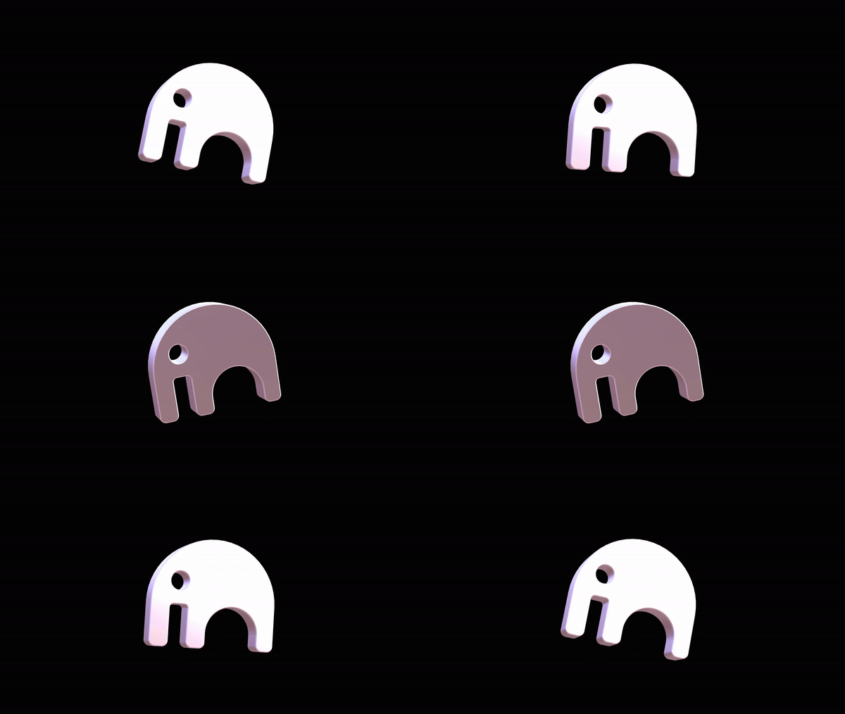
Through reams of sketches and Figma artboards, I arrived at a concept to present to the group. This has rarely happened to me on a first proposal - but a statement from the founder seemed to approve the concept on the spot: "I can't tell you how happy this makes me to see. I can't stop looking at it." Subsequent iterations did take place, but was mainly tweaking the sizing, shading, orientation, and tilt until we arrived at a happy place:
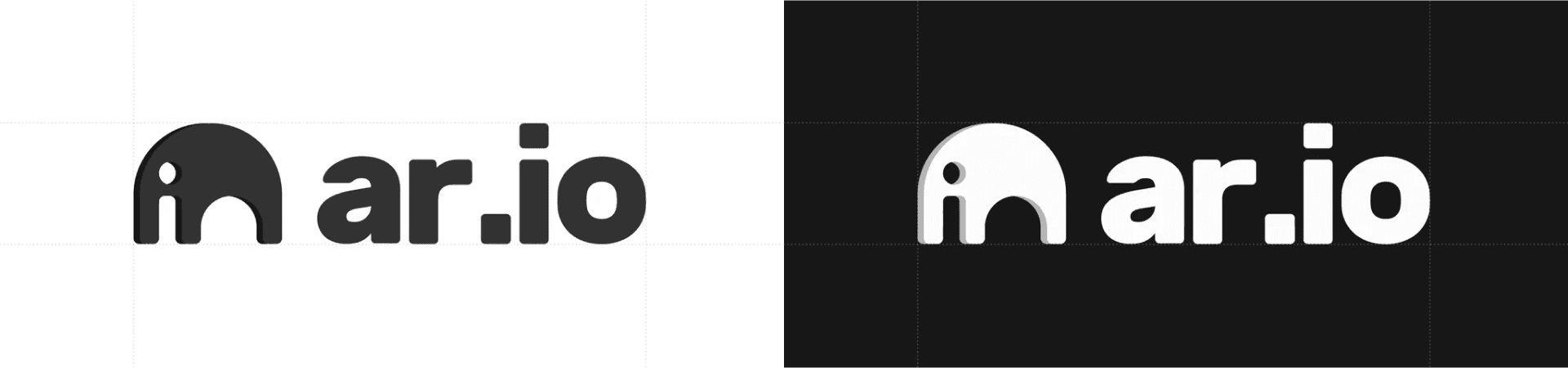
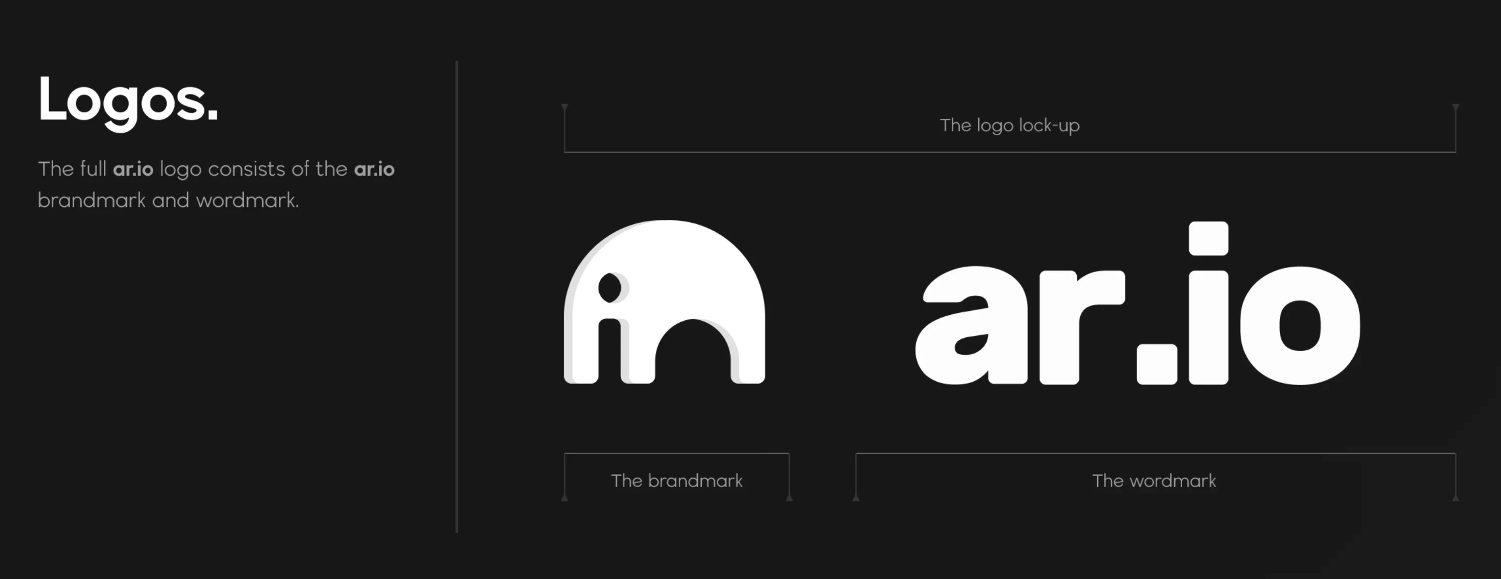
The elephant logo is formed by a negative space I and O, which creates archways implying traffic in and out of the ether, as it were; with the shadow creating a 3D effect. I used Rubik, for readability and because it resembled the shapes and border radii of the logo. A bonus tie-in was for the cubes (blocks) linkage, the colors to represent the diversity of the community supporting them, and the lasting legacy the project wanted to have.
You can check out the full AR.IO brand kit live on their site at: ar.io/brand-kit.
Gestalt Principles in the AR.IO Mark
The AR.IO logomark isn't just a cute elephant – it relies heavily on Gestalt principles to communicate a fairly dense story (I/O, gateways, memory, decentralization) in a simple, memorable form.
Figure–Ground & Negative Space
The elephant is defined as much by what's missing as by what's there. The cut-outs create the letters "I" and "O" while also reading as an archway or gateway. Our perception flips between "elephant" and "I/O gateway," which mirrors the idea of traffic moving in and out of the permaweb.
Closure
Rather than drawing a literal elephant, the mark uses a few key shapes and lets the viewer's brain complete the rest. The simplified silhouette and internal arch rely on closure: we instinctively join the shapes into a coherent figure. This keeps the logo iconic and scalable, while still rich in meaning.
Similarity & Proximity
The same rounded geometry appears in the brandmark, the "ar.io" wordmark, and the chosen typeface. This consistency in shape and rhythm makes the elements feel like a single system. In the lockup, the close spacing between the elephant and wordmark means we perceive them as one unit, even when they're separated or resized in different contexts.
Continuation
The outer curve of the elephant's head and back forms a smooth, continuous line that naturally guides the eye across the mark and into the wordmark. This sense of visual flow subtly echoes the idea of data moving through gateways, supporting the product narrative.
Prägnanz & Symmetry
Although the brief was conceptually dense, the final logo resolves into a simple, balanced form. Our perception defaults to the clearest, most stable interpretation—here, a bold elephant icon—while secondary readings (I/O letters, gateway, "in and out" traffic) emerge on closer inspection. This clarity and symmetry are what make the mark work equally well as a tiny favicon or a large-scale billboard.
Together, these Gestalt principles allow the AR.IO logo to carry a layered story in a single, compact symbol: an approachable elephant that doubles as an abstract I/O gateway into the permaweb.