PitchBlack
A craft label for digital work: confident in black-and-white, flexible in motion.
Overview
Pitchblack is a product and design studio built for clarity, speed, and taste. The brand should feel like a craft label for digital work: confident in black-and-white, flexible in motion, and unmistakable at a glance.
The Challenge
- Read instantly as P and B without gimmicks.
- Work at two extremes: micro (favicons, app chrome) and macro (posters, stage screens).
- Carry a minimal system that still sustains rich layout and motion.
Strategy
Anchor everything in a monogram that can live solo or with a wordmark, then build a restrained system around it: high-contrast type, a modular grid, and motion that says Purposeful, not precious. The palette stays near-monochrome so the work is the hero.
The Solution — PB Monogram
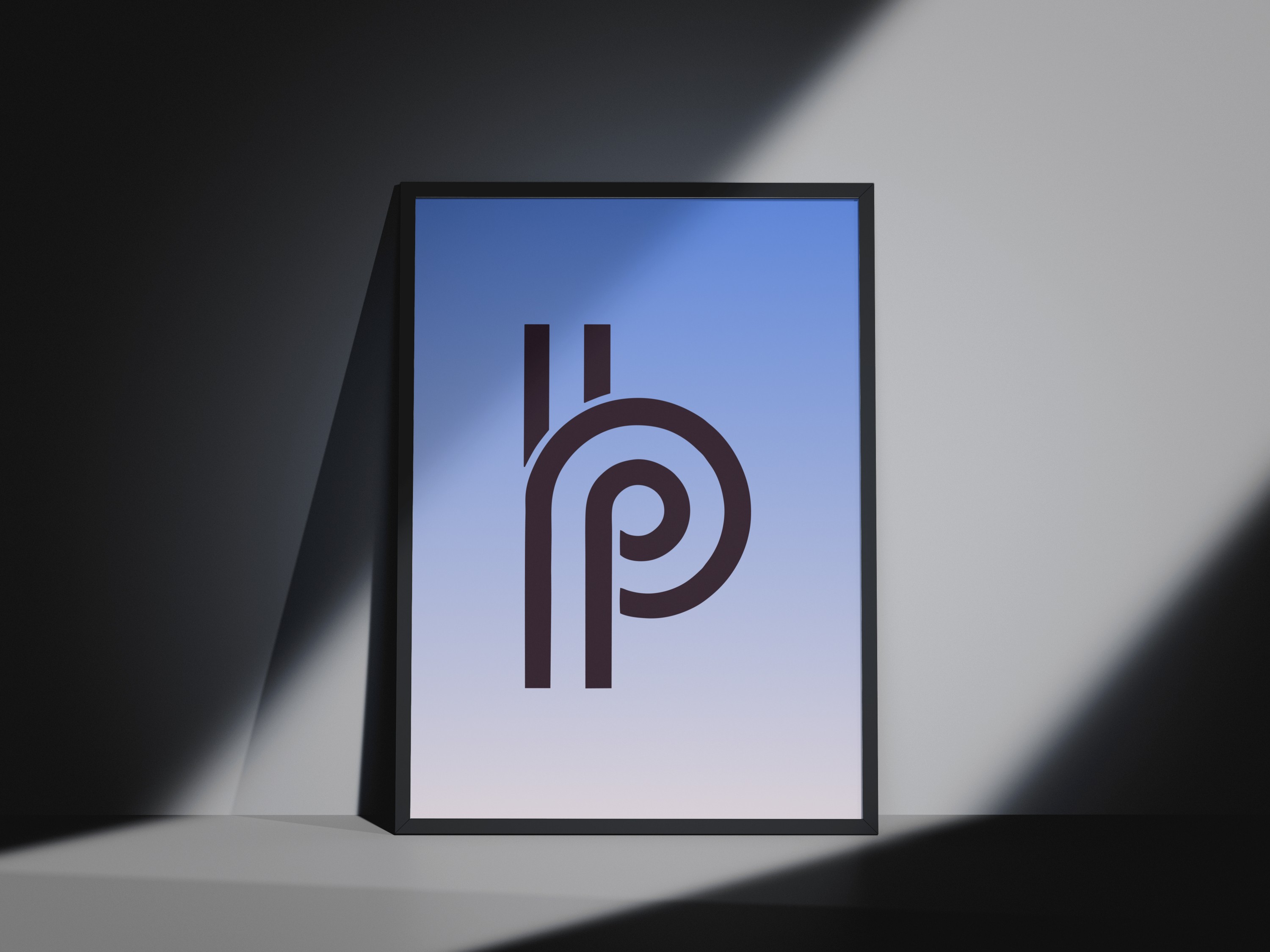
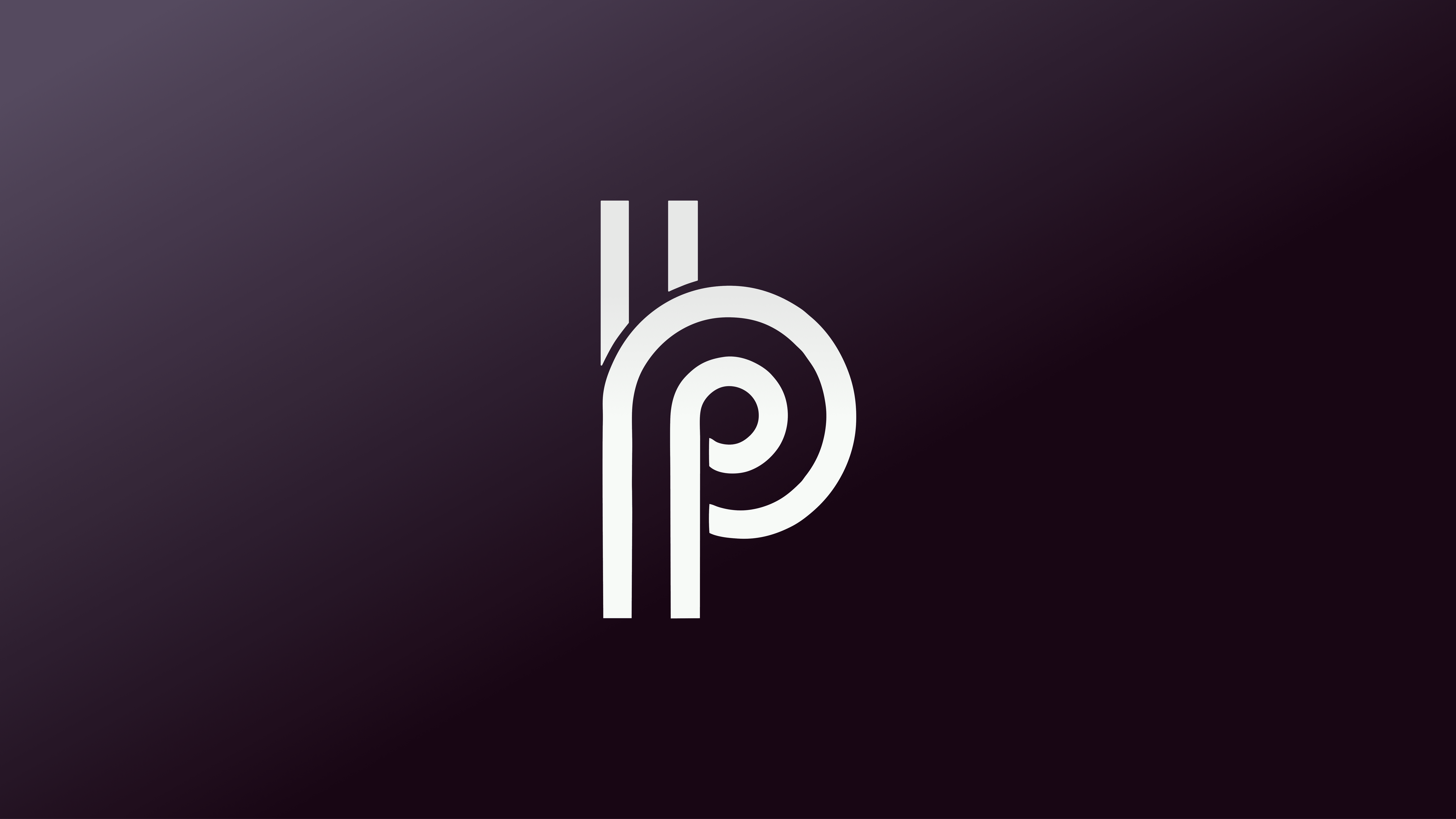
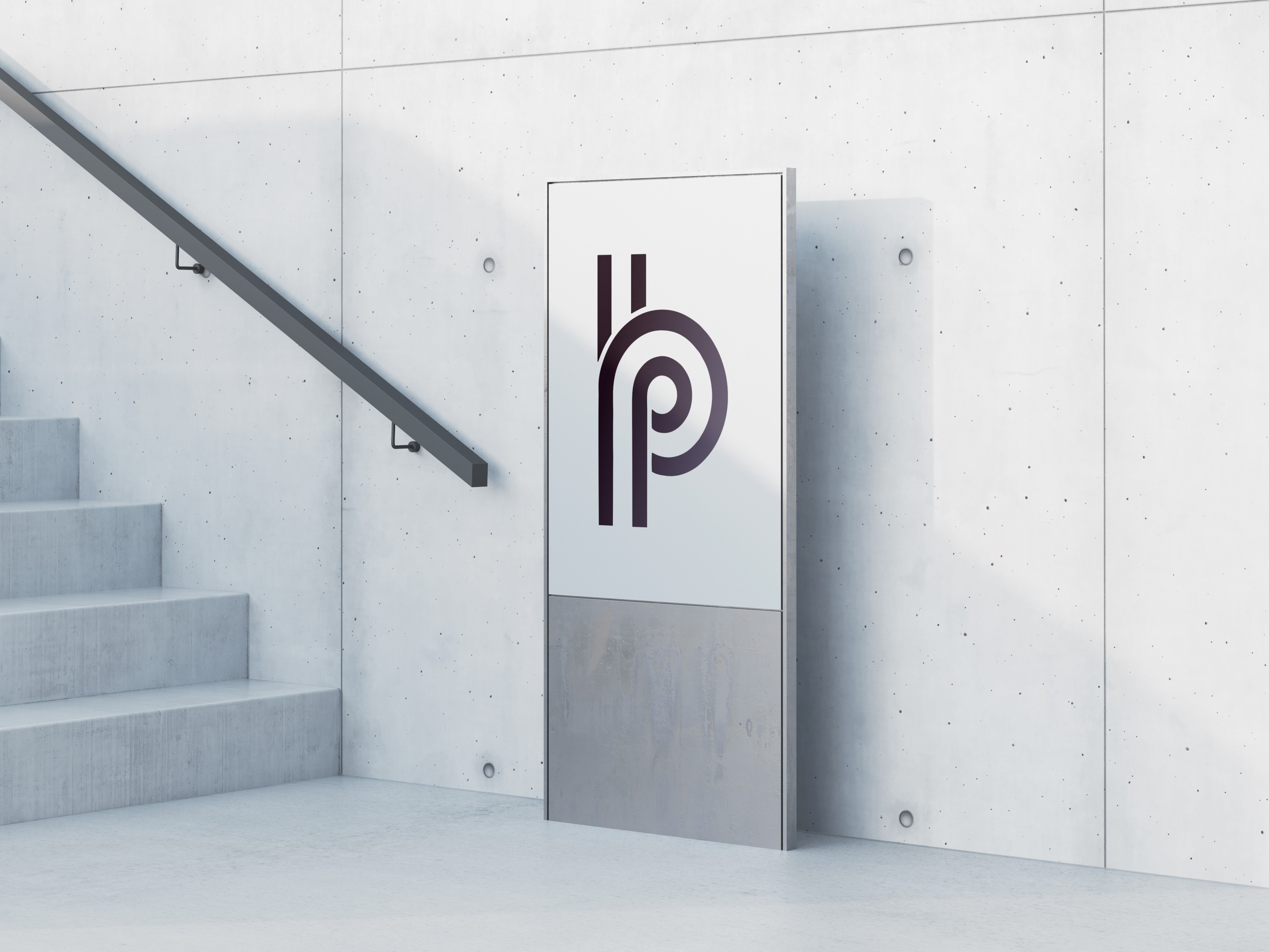
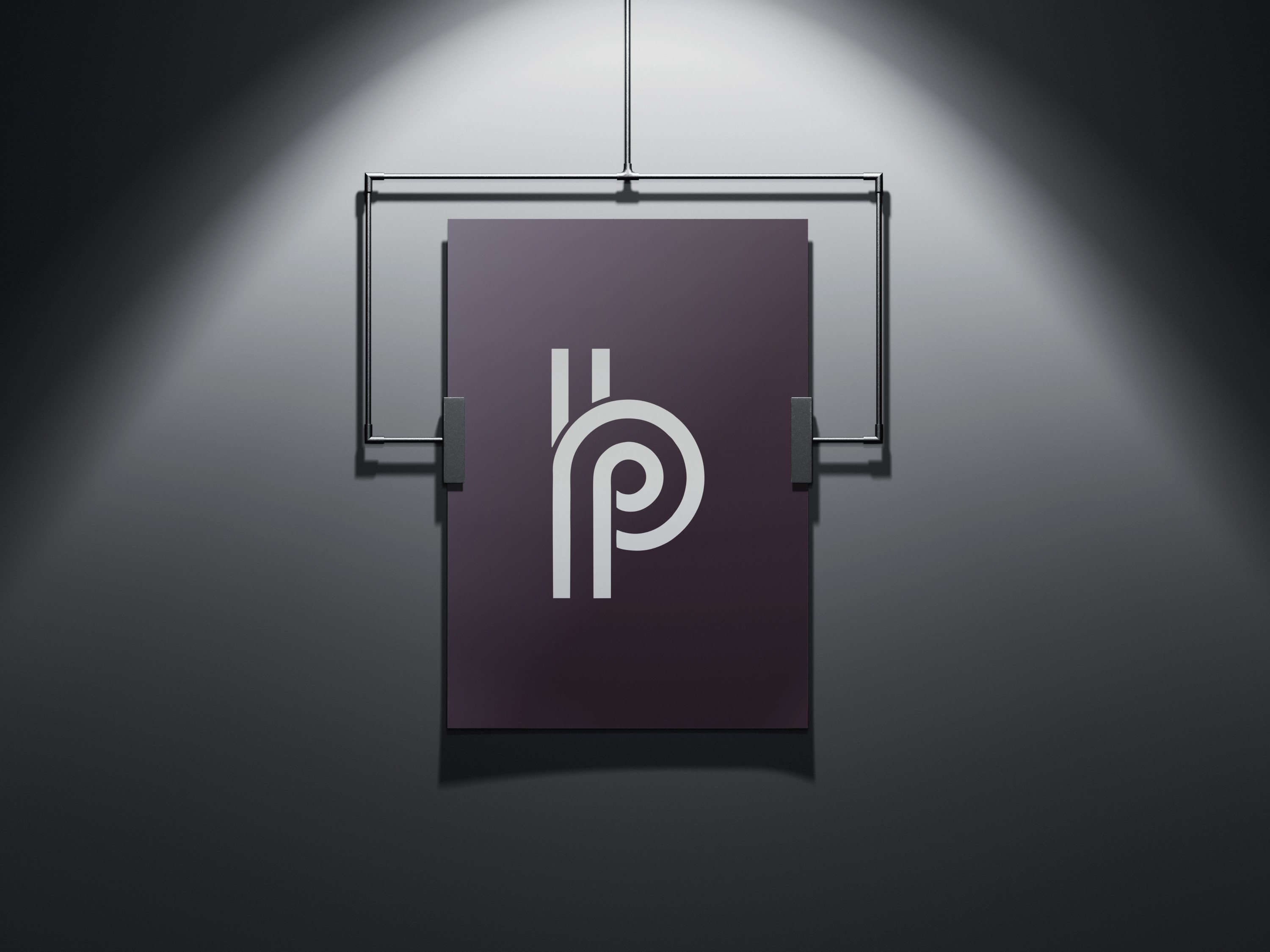
- Two letters, one form. The outer stroke draws a clean P; the inner counter reveals a B. Negative space does the heavy lifting, so it holds at small sizes.
- Geometry with warmth. Hard verticals, rounded internal radii—engineered, not cold.
- Optical tweaks. Overshoot on curves and widened apertures so the B stays legible on dark backgrounds.
- Grid-native. Proportions map to layout columns, cards, and poster blocks.
System Pieces
- Wordmark. Wide modern grotesk with generous tracking for calm headers and case-study titles.
- Palette. True black, paper white, and one restrained accent for links, selections, and data states.
- Type scale. Big headline → compact body with comfortable leading; numerals tuned for telemetry.
- Layout grid. 8-pt base with poster-scale variants; monogram proportions set margins and gutters.
- Motion. Snap-in moves, masked reveals, no flourishes—purposeful cuts under 600ms.
Voice & Tone
Direct, confident, human. Short sentences, strong verbs, zero jargon. Case studies read as decisions and consequences, not adjectives.
Cutting-Room Floor Concepts
Concept 01 — Folded Ribbon
Idea. One ribbon loops to draw P on the outside and
B in the negative space.
Loved. Gorgeous in motion and as hero art.
Why we passed. Too sculptural at favicon size. Lives on as supporting
graphics for section openers.
Concept 02 — Pixel-Block PB
Idea. Modular block letter where P and B share the same unit grid.
Loved. Strong system logic and playful posters.
Why we passed. Skewed retro next to photography; elements survive as
background textures and deck dividers.
Applications
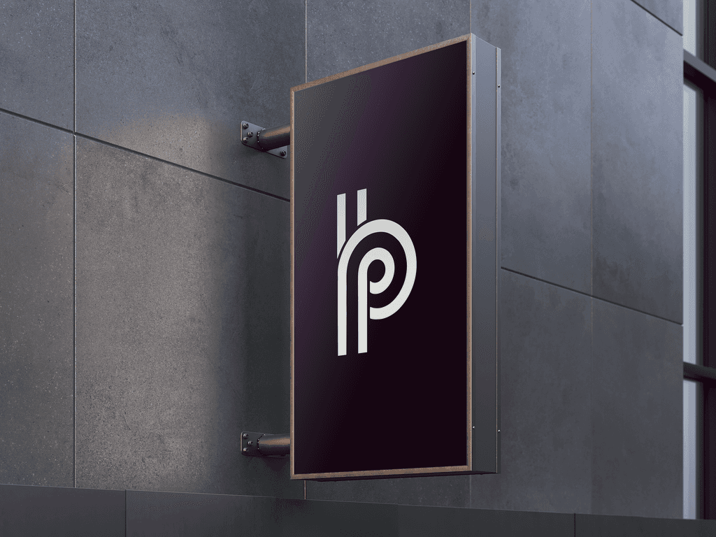
- Site & case studies. Monogram as corner stamp; grid-driven sections; image-first storytelling.
- Proposals & decks. Cover anchored by the PB mark; interior pages reuse the same type and spacing rules.
- Social. High-contrast crops of the monogram and project stills; quick motion stings.
- Merch & events. Embroidered caps, stitched labels, black-only posters that hold up in risograph or screen print.
Deliverables
Logo suite (solid/outline, light/dark) • usage guide • wordmark & spacing rules • color tokens • type scale • grid templates (web/deck/poster) • motion stings • social kit.
Why I felt it worked
The monogram is memorable and minimal—a true P/B read without decoration. The system stays mostly black-and-white so client work shines, and the grid + motion rules keep everything coherent even when the content varies widely.