
ArNS
Human names for the permaweb — infrastructure you can trust that still invites everyone in.
Overview
ArNS is the Arweave Name System. It gives the permaweb human names that resolve to permanent apps and content. If ENS makes wallets pronounceable, ArNS makes permanence approachable. The brand needed to read like internet infrastructure you can trust, and still invite builders and everyday users in.
The Challenge
- Signal protocol-level credibility, not a consumer app.
- Stay legible from tiny address bars to stage screens.
- Feel native to the AR.IO family without losing its own voice.
Strategy
Start with the primitives of the open web — cursor, globe/DNS, orbit, and the letter A — and reduce until one mark can work as logo, grid, and motion language. Keep color restrained so product UI and partner locks remain clean. Let type carry the weight in dense telemetry views.
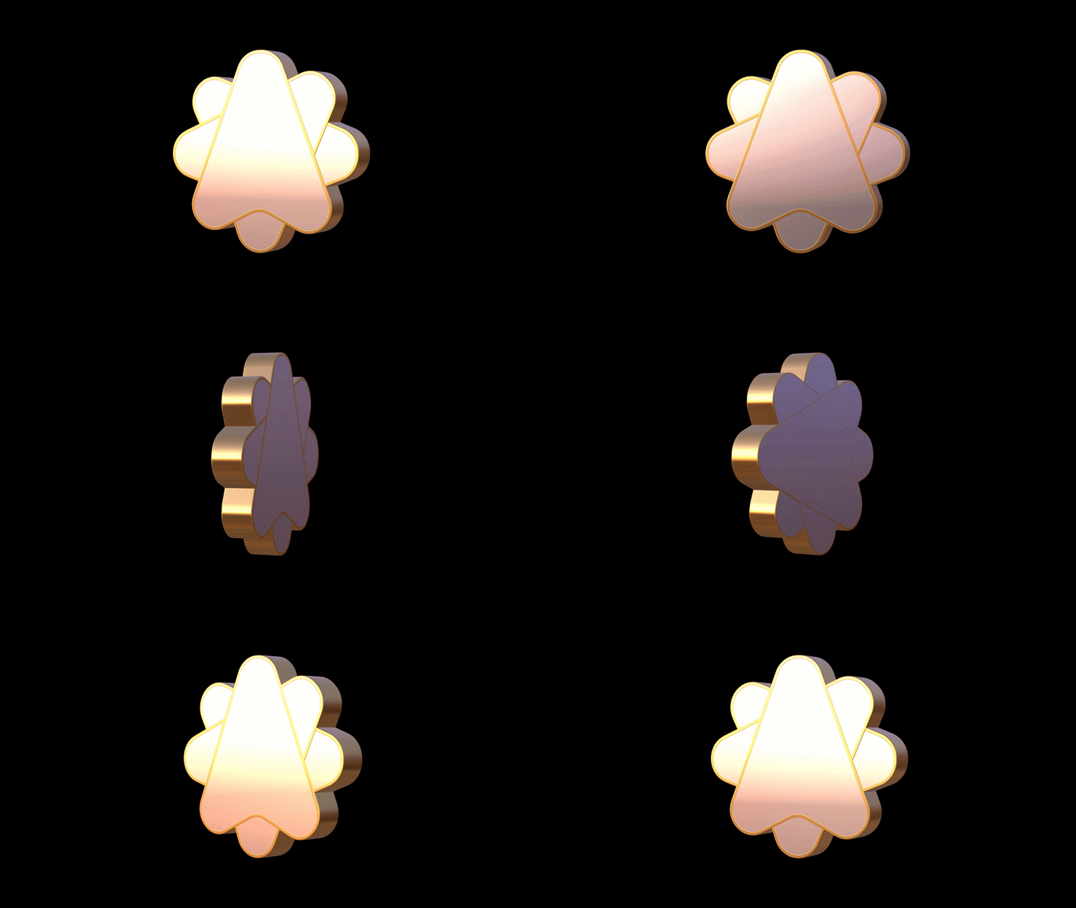
Final Direction — The "A-Globe"
- One idea: an A inside a simple globe. Address meets resolution.
- Direction built in: cursor geometry tucked into the letterform to imply go and resolve.
- Friendly radii: modern and readable on screens.
- Three bands: a quiet rhythm that nods to web1, web2, web3 and doubles as a resolve animation.
System pieces
- Primary mark: A-Globe, solid and outline, light and dark.
- Wordmark: wide modern grotesk with open counters for long names and hashes.
- Palette: graphite base with indigo and violet accents, plus semantic states for product UI.
- Stripe grid: three-band layout for heroes, cards, and diagrams.
- Icons: line icons with rounded terminals — record, route, verify.
- Motion: orbit to lock-in to confirm. Short loops that feel like DNS resolving.
Voice and tone
Plain spoken and confident. Explain what resolves to what, why it is permanent, and what happens next. Facts first. Metaphors only when they help.
Product tie-in
name.ar resolves to an AR.IO gateway subdomain and an Arweave manifest, so full apps can live at human URLs. The system sits cleanly beside AR.IO gateways, AO, and partner marks. Lockup rules keep everyone legible. In docs and dashboards the type scale keeps long names calm and readable.
Cutting-room floor concepts
Concept 01 — "Cursor + Block + A"
(See ingredients image: cursor, block, swoopy radii, A)
- Idea: point to where data lives. A cursor drives into a "block," the basic unit of storage, and resolves as an A.
- Mark: faceted cube with softened corners and a raised ridge that hints at an A when lit.
- Why we passed: beautiful as a 3D badge, a little heavy at small sizes and too object-like for a naming protocol.
Concept 02 — "Rolodex"
(See ingredients image: rolodex dial, asterisk, swoopy radii, cursor)
- Idea: a directory you can spin. The dial suggests records and references, the asterisk nods to sources, the cursor anchors the action.
- Mark: radial slices that converge to a center hub, readable as a directory wheel.
- Why we passed: strong metaphor, but the radial detail fought with long names and looked busy in product UI.
Concept 03 — "Infinity Cursor"
(Ingredients: cursor, infinity loop, swoopy radii, A)
- Idea: permanence you can navigate. The cursor threads through an infinity loop and resolves into an A, hinting at "names that last" and "go to."
- Mark: a continuous ribbon that reads as both ∞ and A at certain angles. It animated beautifully as a loop and made for striking hero art.
- Where it landed: we kept it in the graphic system—hero visuals, section dividers, motion bumpers—because it carries the permanence story with energy.
- Why not the logo: as a primary ident it was a little too sculptural and ambiguous at small sizes, and it overpowered UI contexts where clarity beats flourish. The A-Globe stayed clearer as the everyday mark, while the Infinity Cursor became a supporting motif.
Applications
- Product UI: records, routing, verification, and failure states.
- Docs: quickstart diagrams, resolver flow, record matrix.
- Web and social: announcement cards, partner spotlights, "how it resolves" explainers.
- Event and OOH: high-contrast headlines with the resolve animation as punctuation.
- Motion bumpers: open and close stings for talks and product videos.
Deliverables
Logo suite and usage guide, type scale and color tokens, stripe grid templates, icon set and motion primitives, sample UI screens and diagram library, partner and AR.IO lockup rules.
Why we felt it worked
It reads "infrastructure" at a glance and stays human up close. The A-Globe remains clear from command line to compact UI components, and the three-band rhythm scales into layouts, diagrams, and motion without losing form. Most importantly, ArNS doubles as an identity: the mark and name travel across other apps in the ecosystem to denote an ArNS record—much like ENS badges—so users instantly recognize when they're interacting with a verified, human-readable Arweave address.
