Community Labs
Bridge-building blocks: an identity for a blockchain venture studio.
Overview
Community Labs is a software development company and blockchain venture studio focused on accelerating developer tools, and use cases for web3 applications and foundational infrastructure.
The Challenge
The theme of bridge building was critically important to the founders of the organization - connecting: individuals to initiatives, initiatives to capital; and bridging global communities to collaborate together on projects. The founders also wanted the brand to connote community and the vibrant diversity within them; and the logo to appear cyclical, and ideally include a C or L.
The Solution
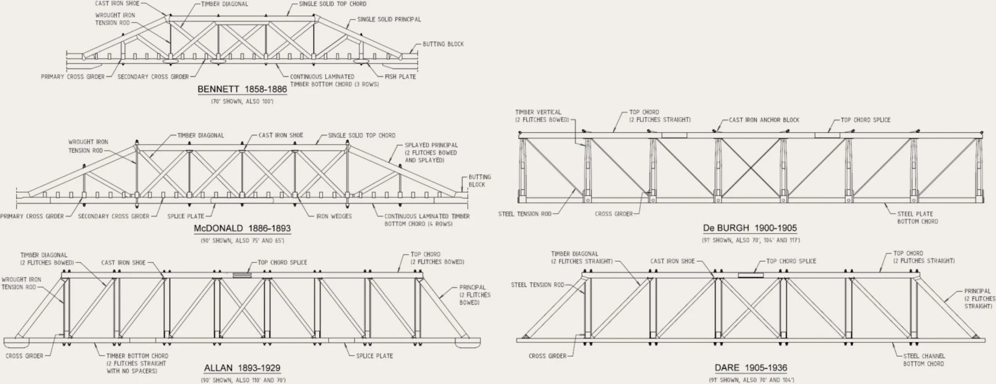
The logo I developed began with looking to bridge architecture and the triangular truss patterns commonly found therein:
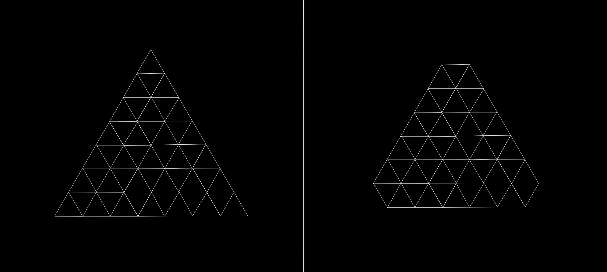
I started sketching a large triangle, and drew dozens of tiny triangles inside it:
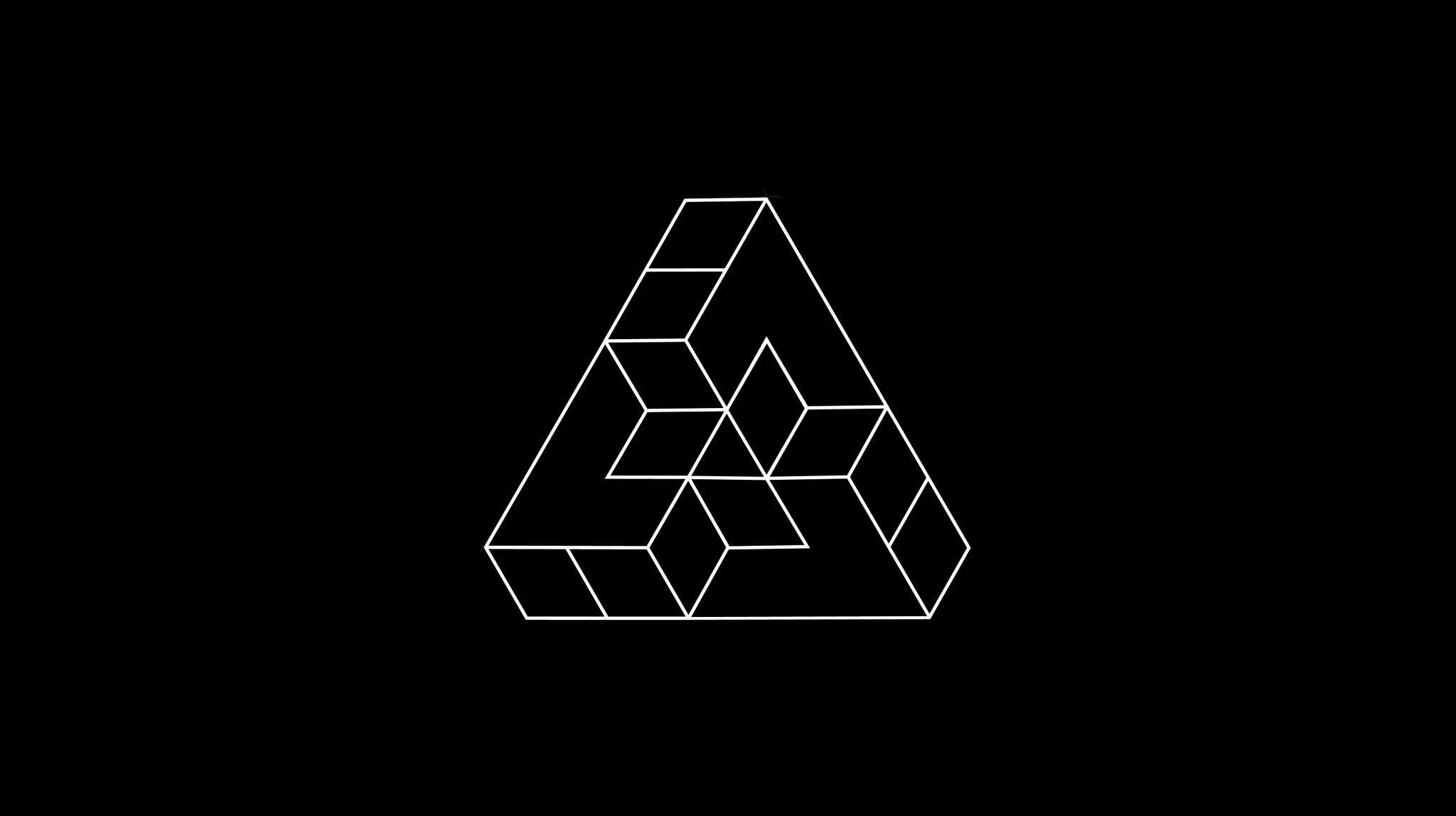
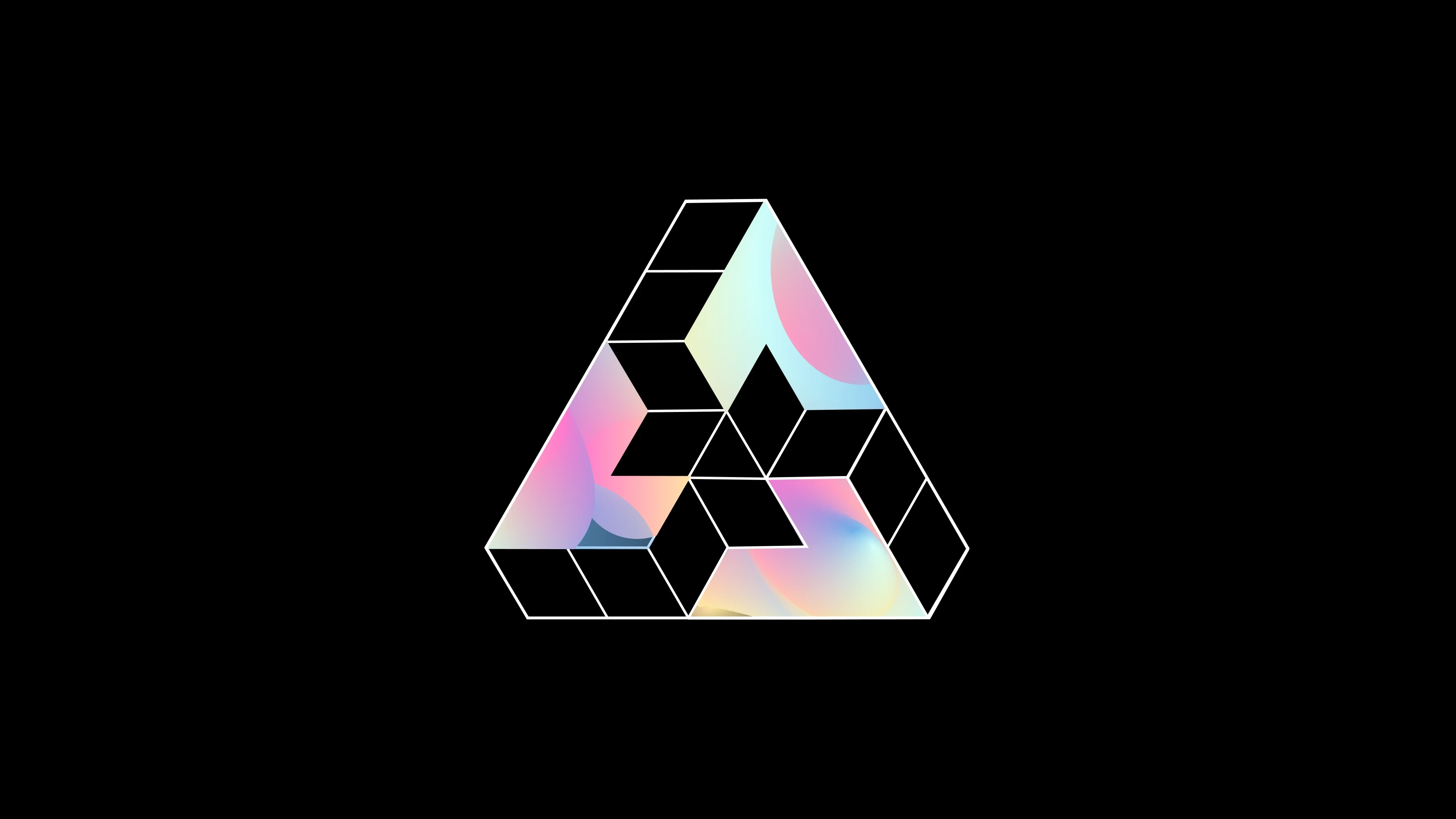
I then began to strip away the smaller triangles and discovered the formation of blocks. This pattern was interesting because it asserted that blocks (that make up blockchains) were also composable building blocks of bridge architecture in the physical world:
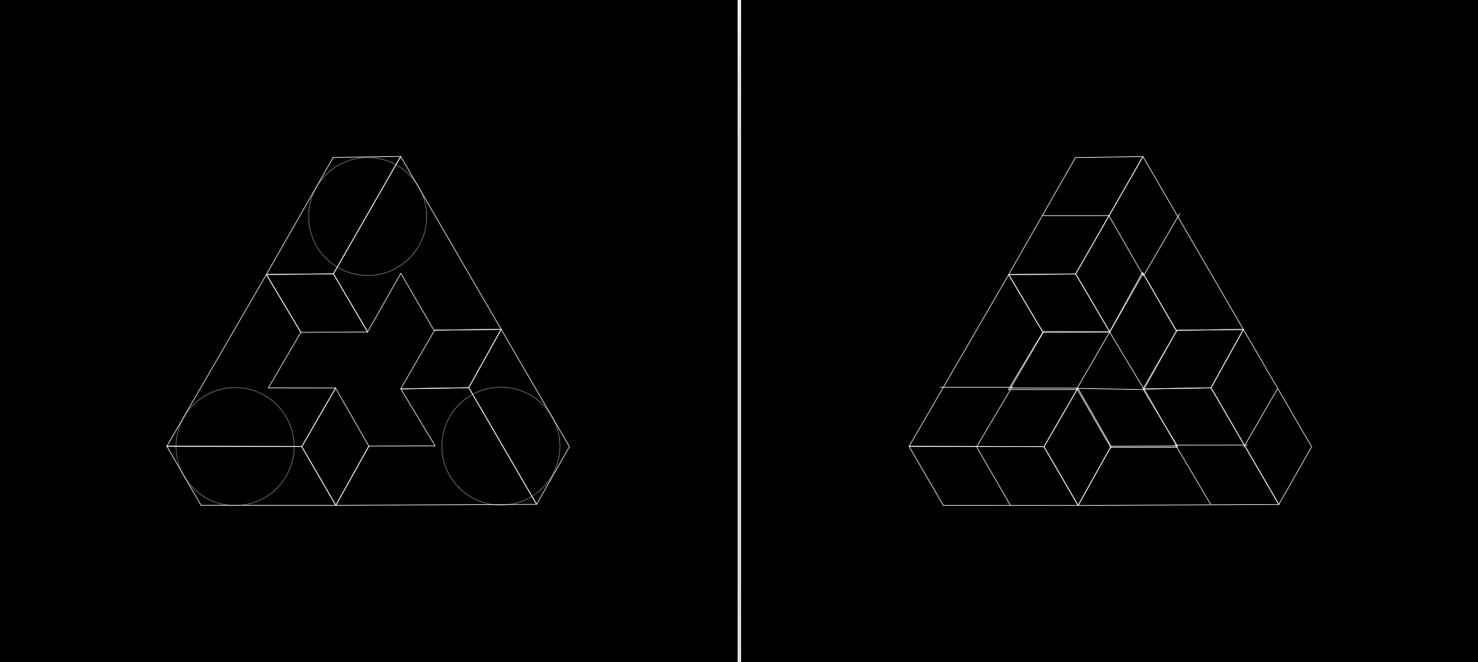
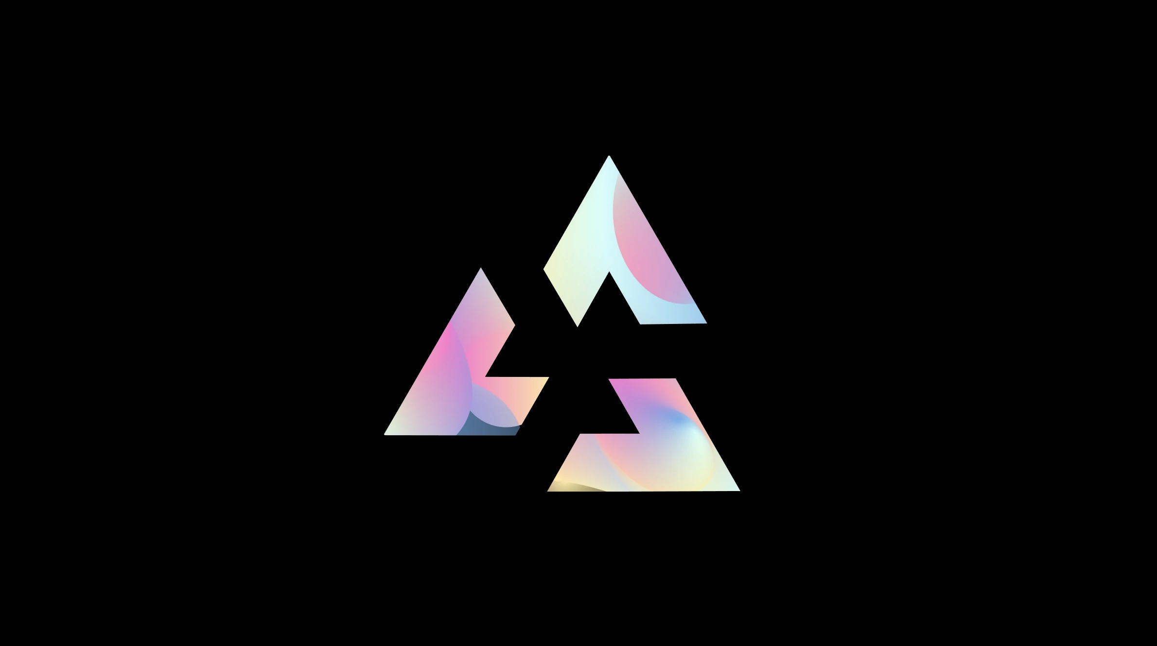
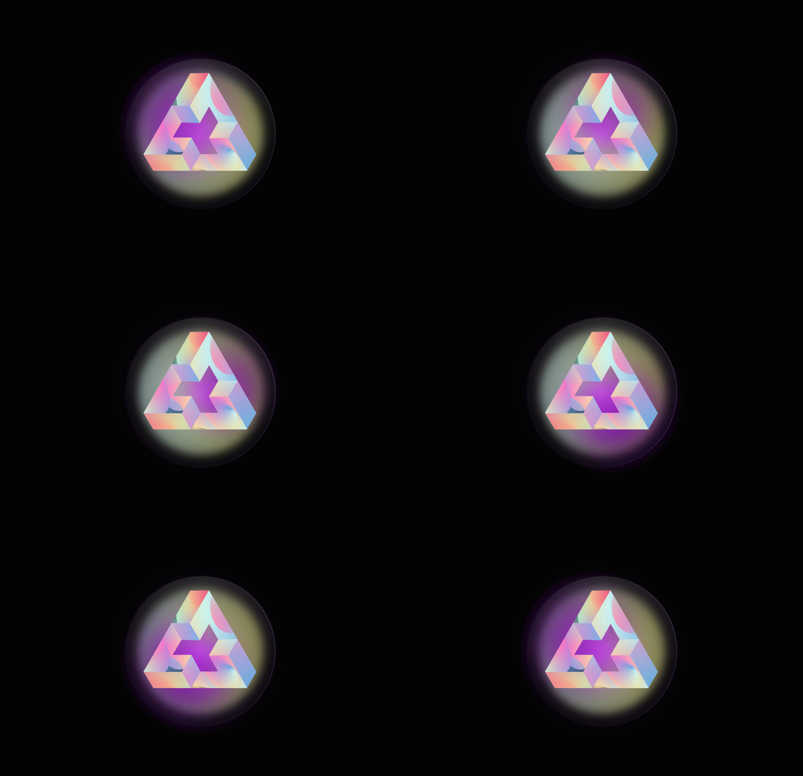
As I abstracted away from the trusses, I leaned into the block structure to form 3 Ls that resembling the cyclical aspect the group was yearning for. The 3 Ls, form the 'community of labs' (Ls) that seek to incubate, accelerate, and support each other in the creation of foundational blockchain infrastructure. I loved that each L touches and supports the other two, while the splashes of gradient colours represent the diversity reflected in the community.